Webinar: Data Visualization Tools
https://www.youtube.com/watch?v=VQXK8xdDa5g
Today we had a great webinar where we looked at some of the more useful and cost effective tools for making good Data Visualizations and discussed some of the theory behind the design. An excellent summary of the information in the webinar can be found below along with the slides and links to some of the things mentioned in the video. The Slides Infogram Switch by Chip and Dan Heath NTAP Gis mapping Videos
A Few Good Data Visualization Tools
By Laura Quinn, Idealware
You have a spreadsheet full of data and a story to tell. You have in mind just the right chart, graph or map that will show others what you see. But how do you make that data visualization a reality? The good news is, you might already have the tool you need—every expert interviewed for this article mentioned Microsoft Excel as a great option for many data visualization needs. In the past few years, a number of other good options have also come to market.
Now the bad news. As in many other areas, software can only do so much when it comes to data visualization, and there’s no easy way to automatically transform raw data into fancy graphics. The heavy lifting—figuring out what the data says, how to present it, and how to format it—is in your hands.
From Data to Visualization Concept
Creating a good data visualization requires way more than just software. Entire books have been written about this topic—you can find links to some of them in the More Resources section—so, for this article, we’ll focus specifically on software to help create data visualizations.
But first, let’s look at the five basic steps of data visualization to better understand what’s involved in the process, which will help you choose the right software for your needs.
1. Define What You’re Trying to Accomplish.
Is your goal just to explore the data yourself to see what it says, or do want to use it to communicate to others? If you’re looking to communicate, do you want to make a specific point or allow others to reach their own conclusions? Or to allow them to compare things over time? Whatever your goals, define the questions you’re trying answer succinctly and make sure your visuals back them up.
2. Use Accurate and Representative Data.
Make sure your facts are actual facts and not “alternative” ones. Make sure you use good data collection practices or gather your data from reliable sources—and cite the sources in your graphic so people can judge the credibility. If you’re collecting the data yourself, make sure the data is truly representative of the story you’re using it to tell, and that you have solid procedures for vetting the data for errors and inconsistencies.
3. Pick the Right Chart.
Don’t just settle for any old graph—experiment with different possibilities to pick the format that best allows the reader to see what you you’re trying to say. You don’t have to reinvent the wheel, though. There’s widely accepted research on the easiest, most accurate formats for different types of data (you can find some of them in the resources). For instance, a bar chart or line chart is almost always easier to interpret than a pie chart or, worse, a 3-D chart.
4. Faithfully Represent Your Data.
It’s one thing to experiment with different possibilities by trying different formats to best represent your data, it’s another entirely to misrepresent your data to make it say what you want. Let the data tell the story, and let the reader see the real trends it shows—for example, by starting each axis at zero to give the whole picture (unless you have a very good reason not to).
5. Make it as Simple as Possible… but no Simpler.
A good graph should call attention to the data rather than the format itself. Strip charts down to only the most critical information for the audience you’re trying to reach. If your audience is fairly familiar with the data (your staff, for example), a more info-heavy visualization could be appropriate than for people seeing it for the first time. Always remove anything superfluous. There’s hardly ever a reason to use a 3-D chart, for instance—it simply adds lines and noise without adding information. Graphic designers talk about this as “saving ink”—what could you represent as well or better with white space?
6. Using Excel To Create Your Concept
Once you know what kind of visualization you want to create, you need to figure out how—what tool should you use? Unless you’re going to create a lot of visualizations or you need them to be interactive (more on that later), your best bet is likely to be Excel. That’s right, Microsoft Excel—the same Microsoft Office Suite tool you use for spreadsheets—is also often the best way to create data visualizations. If you don’t use Excel, nonprofits can get it from TechSoup for a minimal licensing fee. You can install it on Windows or Mac machines or use it online with the Office 365 suite.
Excel has always been a straightforward way to build charts and graphs. But in recent years, Microsoft has expanded its functionality to the point that it can create almost any static chart you might want, with almost any formatting. Newer versions of the software includes a number of useful new chart types, such as scatter plots and histograms. And it’s extremely flexible. You can customize nearly every line, font, color, or piece of white space—that is, if you can figure out how to do it.
That’s where Excel loses some of its shine. Its features are often not very intuitive, and figuring them out means hunting through menus or online tutorials.
7. Other Data Visualization Tools
Overall, Excel is a powerful tool for data visualization. And that power—along with its flexibility and the fact that most people already have it installed—makes it your best option for the majority of cases. But it’s not the only tool.
When might you want to look beyond Excel for more sophisticated software? If the following needs are true:
- You want to quickly and easily make one or two basic-but-polished charts.
- You need to do a lot of exploration of data over time.
- You want to regularly refresh an online visualization, like a dashboard.
- You want users to be able to interact with the visualization online.
Let’s take a look at some of the tools you can use to meet these needs.
Quick and Easy Tools That Are Less Customizable
Excel’s charting is powerful, but not trivial to use. By default it creates charts that look fine but not particularly polished. If you have a straightforward set of data and don’t need to customize it beyond an existing template, a number of better-suited tools allow you to create polished online charts with just a few clicks—without the need for any graphic design sensibilities. Note that these tools are much less customizable than Excel, however, and dramatically limit your options to the provided templates.
Google Sheets, Google’s free online app answer to Excel, provides nice-looking online graphs for simple needs and simple charts. If you want offline charts, you can save them as image files. Another online tool, Infogr.am, provides more than 30 templates that make it straightforward to create attractive charts. It’s free to publish them online publicly; if you want to download charts or make data private, it will cost you $19 per month.
Data Visualization Specialists
Choosing which data you display on a chart can be time-consuming in Excel if you want to explore trends and formats before deciding on a visualization format—especially if you do a lot of them. What’s more, Excel is best when you’re working with fixed data to make static charts—if you want to create a dashboard that is automatically refreshed weekly with new data and allow your users to select the filters they want to see, it might be possible in Excel alone. But it won’t ideal, and it won’t be easy.
There’s a class of tools that address both ease-of-use and interactivity—the two best known are Tableau and Microsoft Power BI. Both allow you to play with data in different formats in a drag-and-drop manner, in a way that’s often easier to understand than Excel. Both let you automatically connect to data sources such as Excel spreadsheets, databases, or certain software packages. Both let you publish dynamic online visualizations that include dashboards, or a collection of multiple visualizations that make it easy for people to get a full picture of a data set.
Once installed on your Windows or Mac desktop, Tableau connects to one or more data sources that then show up as data elements you can drag and drop into sophisticated visualizations. It offers a lot of power for the price—it’s free for a single data source if you don’t mind your data being public on the web, or $58 per license for nonprofits through TechSoup. Once your data is set up, you can publish it on the web in dashboards, tabs, or other formats.
A relatively new offering from Microsoft, Power BI, or Business Intelligence, appears to be positioned to compete directly with Tableau. It offers similar drag-and-drop features to create sophisticated visualizations, which can then be published online in standalone formats or in dashboards. It’s built to merge seamlessly into Excel, and will work with other data sets. For data visualization use, it’s free.
While Tableau and Power BI lead the nonprofit market, and both have nonprofit friendly pricing, they’re not the only tools in this class—others include but Plot.ly, Periscope, and HighCharts.
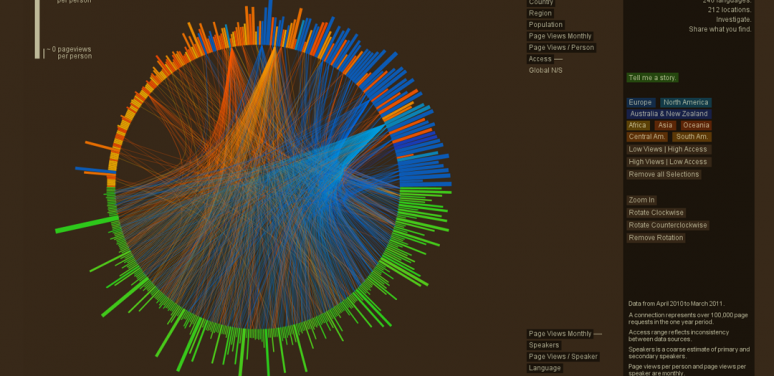
Tools For Mapmaking…
So far, we’ve focused on charts and graphs. But what if you want to create a map? The tools to create a choropleth map—a map that color codes different regions based on a metric (see an example at https://www.nytimes.com/interactive/2016/11/01/upshot/many-ways-to-map-…)—have come a long way in the last few years. In fact, the tools we’ve already covered may well meet your needs—Tableau, Power BI, and Infogr.am offer significant support for maps.
If you want to get really serious about maps, you’ll need to invest time and training into a different kind of tools altogether. While Geographic Information Systems, or GIS tools, would require an article of their own, one in particular, ESRI, is generally considered to be the market leader. ESRI’s tools start at about $1,500 per license, and you can expect a significant learning curve. For an alternative also worth consideration, take a look at Mapbox, which is particularly suited to creating and displaying sophisticated online maps.
…And Beyond
Data analysis professionals go well beyond what we’ve covered here, using specialist tools that require more investments in time or money, and often both. What else might you consider beyond the scope of the tools already mentioned?
For a high degree of control over the look of your chart, or to move beyond a chart into a polished infographic, you’re going to need Graphic Design Software. Illustrator and Photoshop, both part of Adobe’s Creative Suite, are widely used for this purpose, and available to nonprofits at discounted prices through TechSoup. However, both require experience in graphic design and training in the tools themselves.
Data scientists often use Statistical Coding Languages such as Python, R, Stata, or SPSS support sophisticated data analysis and visualization. If you’re considering complex online visualizations, there are a number of Online Coding Libraries—such as D3 or Vega—that a qualified programmer can use to speed the process.
Remember, no software tools can turn a spreadsheet of raw data into a usable visualization without a lot of help from you, but they can make it a lot easier to turn your vision into a polished reality.
For More Information
Evergreen Data - http://stephanieevergreen.com/
Stephanie Evergreen has two books and an incredibly useful blog on how to think through both how you should translate your data into charts and then how to actually do it – entirely in Excel.
PolicyViz - http://policyviz.com/
Jonathan Schwabish, a senior fellow at the Urban Institute, has a blog, podcast, ebook and community site that can help you create effective visualizations and extend certain tools like Excel.
Data Viz Tools - http://dataviz.tools/
Want way, way, way more options? Here’s a usefully structured list of 100s of tools to handle many different aspects of data visualization
Data Visualization 101: How to Choose the Right Chart or Graph for Your Data
A nice summary article describing when each type of chart is likely to be most useful
Graphical Perception: Theory, Experimentation, and Application to the Development of Graphical Methods
http://info.slis.indiana.edu/~katy/S637-S11/cleveland84.pdf
Cleveland and McGill, in a formative and influential paper, created a hierarchy of chart elements by what is understood most easily and accurately
Thanks to the professionals who provided recommendations, advice, and other help:
- Andrew Means, Uptake Foundation beyond.uptake.com
- Bill DeBaun, National College Access Network www.collegeaccess.org
- Mary Winkler and Jon Schwabish, The Urban Institute www.urban.org
- Dr. Stephanie Evergreen, Evergreen Data www.evergreendata.com
- Rachel Perry, Strategic Data Analytics www.sdastrategicdata.com
About Idealware
Idealware, a 501(c)(3) nonprofit, is the authoritative source for independent, thoroughly-researched technology resources for the social sector. Find more free resources about software selection and dozens of other areas of nonprofit technology at www.idealware.org.
Reprinting and Quoting
This work is licensed under the Creative Commons Attribution 4.0 International License. To view a copy of this license, visit http://creativecommons.org/licenses/by/4.0/.