
Snapshot
Description
Definition: Snapshot analysis measures counts or percentages for a specific period, typically the most recently completed year, quarter, or month. It provides a snapshot of the current state of your data.
Purpose: Establishes a baseline or identifies unexpected results requiring further analysis.
Examples:
- Total number of cases handled in the last year.
- Percentage of clients served by demographic category (e.g., age, gender).
Key Insight: If any counts or percentages are unexpected, follow up with comparison, trend, or spatial analyses to explore possible reasons.
Example Data Question
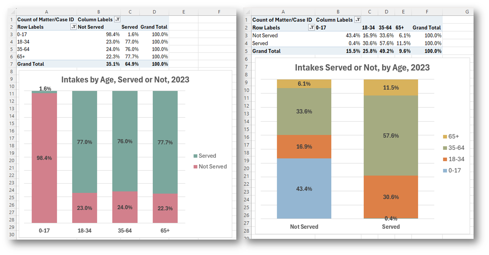
What were the demographic characteristics of the people who requested assistance and we either served or did not serve last year?
Recreate This Analysis
Data Sources
Intake data from your case management system:
- Fields:
- Demographics about which you are curious, such as Age at Intake, Gender, Race, Ethnicity, With Disabilities, Veteran, Percentage of Poverty, Number in Household, Citizenship Status, Language, Living Arrangement, County, etc.
- Dates: Date of Earliest, Intake Date, Prescreen Date, Open Date, Close Date, Date of Rejection, and Date of Birth (for use in an age-related formula).
- Case Information: Legal Problem Code, Problem Code Categories, Close Reason, Rejection Reason, Disposition, Intake Type, etc.
- Filters/Report Structure:
- Date Filters: Date of Earliest in last year, or Intake Date or Prescreen Date in last year.
- Exclude/Filter Out: Test or fake cases and clients and duplicate cases using whichever fields your organizations uses to identify these cases and clients, such as Rejection Reason, Client Name, Case Status, Funding Code, etc.
- Include: Cases that were closed with service, rejected without service, or remain open.
- One Row/Record Per Case: Ensure that downloaded data includes just one record (one row) per case. If necessary, text join fields that cause more than one row/record per case.
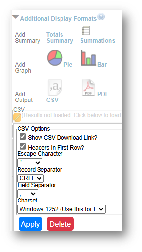
- Export Format:
- If downloading from LegalServer, it is recommended that report results are exported as CSV files (an option that may be set up under Additional Display Format – remember to check Headers in First Row) and saved as Excel files to avoid formatting issues, particularly related to date fields.
Example Analyses Steps
- Download data from your case management system (CMS), use an API link to connect to data in your CMS, or connect to your CMS data directly via an ODBC connection or other method.
- Make sure to include intakes that remain open, that were rejected, or that were closed (either in the year they were opened or later)
- Create Formulas in the downloaded data (using Excel in this example).
- The following formulas create categories that are helpful for analysis.
- Copy these formulas into cells in the far-right columns of your downloaded data (make sure to update the formula references so that they are pointing to the correct fields in your data).
- Add these formulas to all rows of data before creating pivot charts.
- Age Ranges: =IF(AND(AI2=0,ISBLANK(AH2)),"Unknown Age", IF(AND(AI2=0,NOT(ISBLANK(AH2))),"0-17", IF(AI2<=17,"0-17", IF(AI2<=34,"18-34", IF(AI2<=64,"35-64","65+")))))
- Note that AI2=Age at Intake & AH2=Date of Birth.
- Because some databases enter Age=0 when the Date of Birth is blank, this formula ensures that you do not overcount newborns.
- Poverty Ranges: =IF(AND(AE2=0,ISBLANK(Z2)),"Unknown", IF(AND(AE2=0,NOT(ISBLANK(Z2))),"a. Below 100% FPL", IF(AE2<100,"a. Below 100% FPL", IF(AE2<125,"b. Below 125% FPL", IF(AE2<200,"c. Below 200% FPL", "d. 200%+ FPL")))))
- Note that AE2=Percentage of Poverty & Z2=Types of Income.
- Because some databases enter Poverty=0% when Income is blank, this formula ensures that you do not overcount those who actually have $0 income and 0% Poverty Level.
- Served or Not: =IF(O2<>"","Not Served", IF(ISBLANK(N3),"Remaining Open", IF(OR(LEFT(N2,1)="A",LEFT(N2,1)="B",LEFT(N2,1)="F",LEFT(N2,1)="G",LEFT(N2,1)="H",LEFT(N2,1)="I",LEFT(N2,1)="K",LEFT(N2,1)="L"),"Served", IF(OR(LEFT(N2,1)="R",LEFT(N2,1)="X"),"Not Served",""))))
- Note that O2=Rejection Reason & N2=Close Reason.
- This formula divides cases up into Served, Not Served, & Remaining Open categories.
- The following formulas create categories that are helpful for analysis.
- Create Pivot Charts
- Click Insert along the top ribbon, then click on PivotChart.
- Place the first PivotChart in a New Worksheet and rename it Charts.
- Place additional PivotCharts in the same Charts worksheet.
- You will see a blank PivotTable and a blank PivotChart.
- Sort the fields in the PivotChart Fields window, by clicking on the Gear Icon, and selecting Sort A to Z.
- Add the Matter/Case ID (or Case Number) field to the Values window and make sure the calculation is Count.
- If you see Sum of Matter/Case ID, click on the drop down, select Value Field Settings, and change the calculation type to Count.
- If you see Sum of Matter/Case ID, click on the drop down, select Value Field Settings, and change the calculation type to Count.
- Drag the Served or Not formula you just created into the Columns window and any of the fields you are interested in analyzing into the Axis (Categories) window and notice how the PivotTable and PivotChart update.
- You may want to swap the data, dragging Served or Not into the Axis (Categories) window and the other field (Age Ranges in this example) into the Columns window.
Format the chart as you prefer. Here are the steps taken to change the original chart to these final versions, which differ based on which field is in the Axis (Categories) window and which field in in the Columns window:

- Change the Number Format to Percentage: Right click on any cell in the PivotTable and select Show Values as > % of Row Total. Select all percentages in the table and adjust the number of decimal places to one with the Decrease Decimal button across the top ribbon.
- Change the Chart Type: With the chart selected, click on Design along the top ribbon and then click on Change Chart Type (in this example, 100% Stacked Column was selected).
- Change colors: With the chart selected, click on Design along the top ribbon and then click on Change Colors. Or change the fill color for each column by right clicking within the column and selecting your preferred colors from the Fill option.
- Edit the Title: Click on the existing title and type over it. You may change the font size and make it bold.
- Remove PivotChart Buttons: If you will be sending the entire spreadsheet to a colleague and want them to be able to filter the visual themselves, you may want to leave the PivotChart Axis Field Button, but you will likely still want to remove the Value Field Button. If you will be copying this visual into a presentation or sending a static copy to a colleague for their viewing only, you will likely want to remove all PivotChart buttons. To remove some or all buttons, with the chart selected, click on PivotChart Analyze along the top ribbon, click on the Field Buttons drop down, and uncheck specific buttons or select Hide All to remove all buttons.
Hide Unknown or Blank Data: Click on the filter button and unchecking Unknown or Blank in the PivotTable Row Labels drop-down. There may be significant blank data when working with intakes and prescreens. You may want to leave the blank data in your charts, but hiding it provides the viewers insight into the share of intakes/prescreens by demographic characteristic among those for whom that characteristic is known. These known data percentages can serve as a good representation, or proxy estimate, for all those who requested assistance. In this example, Remaining Open Intakes were also deselected by unchecking Remaining Open in the PivotTable Column Labels drop-down
- Change the Number Format to Percentage: Right click on any cell in the PivotTable and select Show Values as > % of Row Total. Select all percentages in the table and adjust the number of decimal places to one with the Decrease Decimal button across the top ribbon.
- Click Insert along the top ribbon, then click on PivotChart.
- Refreshing Data: Once a spreadsheet like is set up, you may download new data and copy it into data tab from which the Chart tab pulls data.
- Make sure the columns of the new data match the columns in the existing spreadsheet exactly.
- If there are more records in the new data, the formulas created in the far-right columns will need to be copied down to all rows.
- From within your Charts tab, select one of your PivotCharts or PivotTables, then click on PivotChart Analyze along the top ribbon. First click on Change Data Source and make sure that all new rows of data are included. Then click on Refresh and Refresh All. Every PivotTable and PivotChart should update. If not, repeat this step for each PivotChart or PivotTable.


Related Questions You May Ask
- How many people does my organization help/serve, and what are their demographics?
- How many people from specific groups (e.g., vulnerable populations) or with certain legal problems are helped/served?
- How many people is my organization unable to help?