
Comparison
Description
Definition: Comparison analysis examines relationships between two or more variables to uncover insights about client conditions or data linkages.
Purpose: Highlights disparities, disproportionalities, differences, relationships, or conditions requiring further investigation.
Examples:
- Comparing service rates by gender or ethnicity.
- Analyzing links between poverty levels and case types.
Key Insight: When unexpected differences arise by demographics or legal problem, investigate to understand the data relationships and determine whether advocacy or services targeting multiple conditions are needed.
Example Data Question
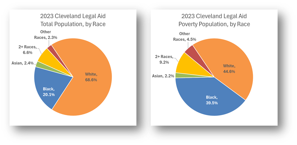
Are there racial or ethnic groups in our service area that are disproportionately poor? (e.g., How does the racial and ethnic make up of the Legal Aid Society of Cleveland’s service area (Ashtabula, Cuyahoga, Geauga, Lake, & Lorain counties) total population compare to the racial and ethnic make up of the service area’s poverty population?)
Recreate This Analysis
Data Sources
U.S. Census American Community Survey data at Census Bureau Data
- S1701 Poverty Status in the Past 12 Months
- Contents: Poverty (<100%) counts and percentages by age, sex, race, educational attainment, employment status, and work experience, and population totals by poverty at various levels (including <125%, <200%, etc.).
- Data Limitation: This table does not provide detailed demographic characteristics about the <125% poverty level population, but it does have data for all 5 counties, including counties with small populations.
Example Analyses Steps
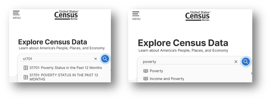
- Open the Census Bureau's Explore Census Data website.
- Type "s1701" in the search bar for our example.
In the future, if you know you need the S1701 Poverty Status in the Past 12 Months table, type "s1701" in the search bar. If you do not know the table name, you may enter a search term, such as "poverty" to be taken to a list of relevant tables, including S1701.
- Click on the S1701 table.
- Click on +View All 25 Products under the table name.
- Click on 2023: ACS 5-Year Estimates Subject Tables
- If your geographies have populations over 65,000, you may stay with the default 1-Year Estimates, which provide more current, but less reliable data or you may use 5-Year Estimates, which provide less current, but more reliable 5-year averages. If some or all of your geographies have fewer than 65,000 people, you must select 5-Year Estimates.
- For information about choosing 5-year or 1-year estimates, refer to Using 1-Year or 5-Year American Community Survey Data.
- Under Geographies in the far-left filter panel, select a geographic level, and click on it (In this example: geographic level is County).
- Select a state (Ohio in this example).
- Click on all the counties you need added (5 Ohio counties were selected in this example: Ashtabula, Cuyahoga, Geauga, Lake, & Lorain).
- Once all geographies have been added, click on close panel << button.
- To avoid downloading the Margin of Error data, click on the Margin of Error button along the top ribbon before downloading the data.
- Click on the Excel button along the table ribbon to download an Excel version of the table or the CSV button to download a CSV version of the table. If you do not see the Excel or CSV buttons in the top ribbon, click on More Tools at the far right of the ribbon.
- The Excel version is formatted to be more user-friendly and includes an Information tab that provides table details and notes whereas the CSV version includes only unformatted data. The CSV version can be easier to work with when you are downloading data for more than one geography or data for more than one year, as long as they are saved as Excel files after being downloaded in CSV format.
- Open the data file(s):
- If the numbers downloaded in text format, highlight the relevant cells, right click, and select Convert to Number.
- Scroll down to the RACE AND HISPANIC OR LATINO ORIGIN rows and focus on the Total column & the Below poverty level Estimate columns.
- Note that the Hispanic or Latino origin (of any race) category overlaps with the race categories above it. For example, White alone includes people who identify as Hispanic or Latino. Additionally, the White alone, not Hispanic or Latino category is a subset of the White alone category.
- Perform calculations:
- To find the Total Population and the Poverty Population for the service area by each race and ethnicity category, create a column in which you add the numbers for each geographic area (5 counties in this example) to get grand totals for the entire service area (see the columns with blue and purple font in the image).
- To find each race and ethnicity category’s Share of the Total Population and Share of the Poverty Population, divide the numbers in the totaled columns by the service area’s totals (5-County Total Population: 1,948,411, & 5-County Poverty Population: 279,012 in this example).
- Create charts:
- Create charts that can be compared to each other (for this example, the pie slices for various races can be compared between the 2 pie charts to see if any race has a disproportionately large share of the poverty population compared to their share of the total population).
- It may be helpful to copy the data you want to visualize into new cells, combining categories with small numbers into one larger Other category and applying shorter category names prior to creating charts.
- Because of the overlap in racial and ethnic categories, you should not create pie charts using both the race and ethnicity categories together.
Format your chart(s) to improve clarity, including shortening category names, increasing font size, adding data labels, editing the title, and varying pie slice colors.


Related Questions You May Ask
- Are there specific vulnerable populations (defined by demographics) that make up a significant share of the eligible population? How do these populations compare to or overlap with each other?