
Trend
Description
Definition: Trend analysis examines changes over time to identify patterns, spikes, or dips in client conditions or service needs.
Purpose: Tracks improving and/or worsening conditions, progress or regress, and emerging issues.
Examples:
- Monitoring increases in housing-related cases over five years.
- Tracking the seasonal variation of client intakes.
Key Insight: Analyze trends over a five-year period (or longer when possible). Unexpected changes, such as spikes or dips, may confirm expectations or raise new questions about whether proactive steps are necessary.
Example Data Question
How has the poverty rate of various demographic groups changed in our service area over time? (e.g., How have the poverty rates changed for seniors age 65+ and persons with disabilities in Cook County Illinois over the last 5 years?)

Recreate This Analysis
Data Sources
U.S. Census American Community Survey data at Census Bureau Data
- S1703 Selected Characteristics of People at Specified Levels of Poverty in the Past 12 Months
- Contents: Percentages of people at <50%, <100%, and <125% of the Federal Poverty Level by age, sex, race and ethnicity, living arrangement, educational attainment, nativity and citizenship status, disability status, and work status.
- Data Limitation: This table is only available for geographic areas with large populations, so it is most useful when looking at state-wide or large county data.
Example Analyses Steps
- Open the Census Bureau's Explore Census Data website.
- Type "s1703" in the search bar for our example.
- In the future, if you know you need the S1703 Selected Characteristics of People at Specified Levels of Poverty table, type "s1703" in the search bar. If you do not know the table name, you may enter a search term, such as "poverty" to be taken to a list of relevant tables, including S1703.
- In the future, if you know you need the S1703 Selected Characteristics of People at Specified Levels of Poverty table, type "s1703" in the search bar. If you do not know the table name, you may enter a search term, such as "poverty" to be taken to a list of relevant tables, including S1703.
- Click on the S1703 table.
- Click on +View All 27 Products under the table name.
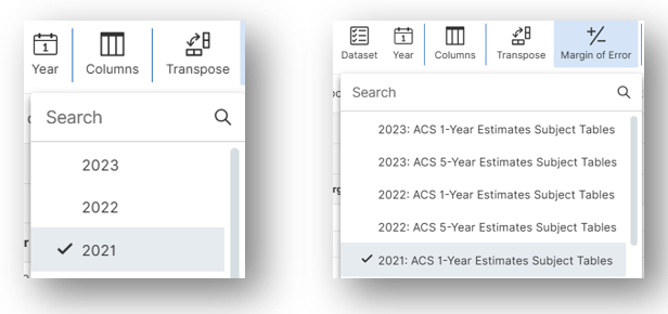
- Click on 2023: ACS 1-Year Estimates Subject Tables.
- If your geographies have populations over 65,000 you may stay with the default 1-Year Estimates, which provide more current, but less reliable data or you may use 5-Year Estimates, which provide less current, but more reliable 5-year averages. If some or all of your geographies have fewer than 65,000 people, you must select 5-Year Estimates.
- When analyzing trends over time, use 1-Year Estimates if available.
- For information about choosing 5-year or 1-year estimates, refer to Using 1-Year or 5-Year American Community Survey Data
- Under Geographies in the far-left filter panel, select a geographic level, and click on it (In this example: geographic level is County).
- Select a State (Illinois in this example).
Click on all the county or counties you need added (only Cook County in this example).
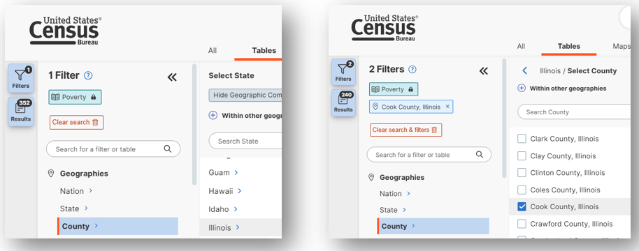
- Once all geographies have been added, click on close panel << button.
- To avoid downloading the Margin of Error data, click on the Margin of Error button along the top ribbon before downloading the data.
- Click on the Excel button along the table ribbon to download an Excel version of the table or the CSV button to download a CSV version of the table. If you do not see the Excel or CSV buttons in the top ribbon, click on More Tools at the far right of the ribbon.
- The Excel version is formatted to be more user-friendly and includes an Information tab that provides table details and notes whereas the CSV version includes only unformatted data.
- The CSV version can be easier to work with when you are downloading data for more than one geography as long as they are saved as Excel files after being downloaded in CSV format.
Download 5 separate data files for 5 years of data. Because 2020 Table S1703 data are not available, download data files for 2018, 2019, 2021, 2022, and 2023. To change the year before each download, click on the top ribbon Year button. After changing the year, make sure that you are still downloading 1-Year Estimates. To verify the Estimate Dataset, click on the top ribbon Dataset button.
- Open the data file(s):
- If the numbers downloaded in text format, highlight the relevant cells, right click, and select Convert to Number.
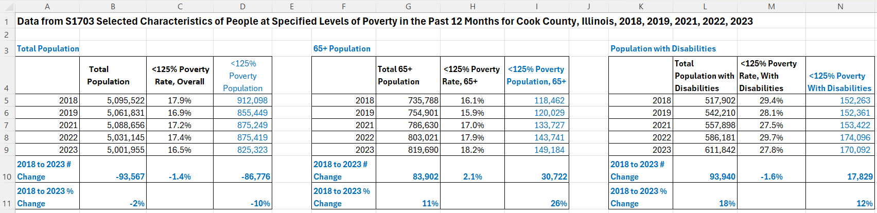
- Scroll down to the 65 years and over and the With any disability rows and focus on the Total & the Less than 125 percent of the poverty level columns.
- Open a new spreadsheet for calculations and charts:
- From the downloaded data tables for each year, copy the columns Total (number) and Less than 125% poverty (rate) from the top row, Population for whom poverty status is determined (which is the total poverty and non-poverty population), the 65 years and over row and the With any disability row into calculation tables to the right of the downloaded data.
- Perform calculations:
- To find the number of people at Less than 125% of the poverty level for these categories (65 & Older, With Disabilities in this example), create a column in which you multiply the percentages by the total numbers (columns D, I, & N in the calculation tables below).
- To calculate the count and proportional change over time, create a row in which 2023 numbers are subtracted from 2018 numbers (row 10 below). Create a second row in which the difference is divided by the 2018 numbers to calculate the proportional change percentage (row 11 below).
- In this example, these calculated tables reveal interesting findings, individually and when compared to each other, including:
- Consistently higher <125% poverty rates for people with disabilities than for those age 65+ and for the total population.
- Growth in the 65+ <125% poverty population numbers at a higher rate (+26%) compared to the change in the 65+ total population (+11%), meaning older persons have become poorer in this period.
- Growth in the <125% poverty population with disabilities (+12%) at a slower rate compared to the change in the total population with disabilities (+18%), meaning the population with disabilities has become less poor in the period.
- The <125% poverty rate for seniors has increased (+2.1%) while the <125% poverty rate for those with disabilities has decreased (-1.6%) as has the <125% poverty rate for the total population (-1.4%).


- Create charts:
- Create a column chart that compares poverty rates over time by pulling from the poverty rate data for the overall population and for the categories you have selected to analyze.
Format your chart(s) to improve clarity, including increasing font size, adding data labels, editing the title, shrinking the gap width between columns, hiding the vertical axis, and varying column and data label colors.

Related Questions You May Ask
- How have the number, demographics, and representation of specific vulnerable populations among eligible people changed over time?