
Comparison
Description
Definition: Comparison analysis examines relationships between two or more variables to uncover insights about client conditions or data linkages.
Purpose: Highlights disparities, disproportionalities, differences, relationships, or conditions requiring further investigation.
Examples:
- Comparing service rates by gender or ethnicity.
- Analyzing links between poverty levels and case types.
Key Insight: When unexpected differences arise by demographics or legal problem, investigate to understand the data relationships and determine whether advocacy or services targeting multiple conditions are needed.
Example Data Question
How did levels of service (advice/limited service versus extended service) compare for different client demographics and case legal problems last year?
Recreate This Analysis
Data Sources
Closed Case data from your case management system:
- Fields:
- Demographics about which you are curious, such as Age at Intake, Gender, Race, Ethnicity, With Disabilities, Veteran, Percentage of Poverty, Number in Household, Citizenship Status, Language, Living Arrangement, County, State, Zip Code, etc.
- Dates: Date of Earliest, Intake Date, Prescreen Date, Open Date, Close Date, Date of Rejection, and Date of Birth (for use in an age-related formula).
- Case Information: Legal Problem Code, Problem Code Categories, Close Reason, Rejection Reason, Disposition, Intake Type, etc.
- Filters/Report Structure:
- Date Filters: Close Date in the last year.
- Exclude/Filter Out: Test or fake cases and clients and duplicate cases using whichever fields your organizations uses to identify these cases and clients, such as Rejection Reason, Client Name, Case Status, Funding Code, etc. And cases with Rejection Reasons entered or with Close Reasons indicating no service provided (ex: R-Rejected, X-Error).
- Include: Cases that were closed with service (not rejected).
- One Row/Record Per Case: Ensure that downloaded data includes just one record (one row) per case. If necessary, text join fields that cause more than one row/record per case.
- Export Format:
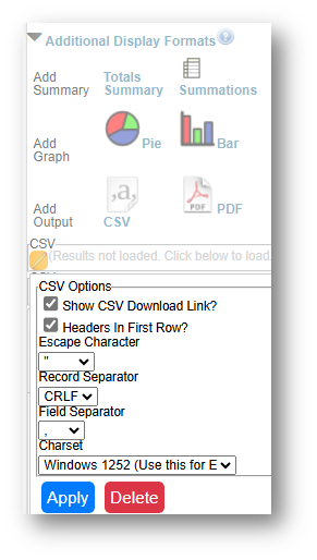
- If downloading from LegalServer, it is recommended that report results are exported as CSV files (an option that may be set up under Additional Display Format – remember to check Headers in First Row) and saved as Excel files to avoid formatting issues, particularly related to date fields.
Example Analyses Steps
- Download data from your case management system (CMS), use an API link to connect to data in your CMS, or connect to your CMS data directly via an ODBC connection or other method.
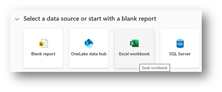
Open Microsoft Power BI and select Excel as your data source.
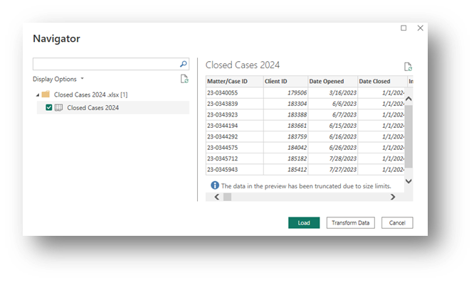
Connect to the CMS downloaded data file (from step 1), click the check box next to the tab name and click on Load.
- Save your Power BI file.
Create New Columns
- The following New Columns create categories that are helpful for analysis.
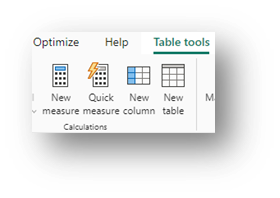
- Click on the name of your data file in the Data pane and either right click to select New Column or select the New Column button from the Table Tools ribbon across the top.
- Copy these formulas (over “Column = in the formula bar) into New Columns (make sure to update the formula references so that they are pointing to the correct fields in your data).
- To change field references, highlight the field references in these formulas from opening single quote to closing right bracket (example: ‘Closed Cases 2024’[Race]), enter a single quote and a list of the fields in your table should appear from which you can choose.
- Click on the green check box next to the formula bar to verify the formulas are working and to create the new columns.
- Add these new columns before creating visuals.
- Click on the name of your data file in the Data pane and either right click to select New Column or select the New Column button from the Table Tools ribbon across the top.
- Race Formula:
Race Formula = SWITCH( TRUE(),
'Closed Cases 2024'[Race] = "Black or African American", "Black", 'Closed Cases 2024'[Race] = "American Indian or Alaska Native", "AIAN",
OR('Closed Cases 2024'[Race] = "Other", 'Closed Cases 2024'[Race] = "Native Hawaiian or other Pacific Islander"), "Other",
OR('Closed Cases 2024'[Race] = "", 'Closed Cases 2024'[Race] = "Prefer not to disclose"), "Unknown", 'Closed Cases 2024'[Race]) - Ethnicity Formula (for organizations that also have a HUD Ethnicity field):
Ethnicity Formula =
IF ( OR ('Closed Cases 2024'[Ethnicity] = "Hispanic", 'Closed Cases 2024'[HUD 9902 Ethnicity] = "Latino/Hispanic" ), "Hispanic/Latino",
IF ( OR ('Closed Cases 2024'[Ethnicity] = "Non-Hispanic", 'Closed Cases 2024'[HUD 9902 Ethnicity] = "Non-Latino/Non-Hispanic" ), "Non-Hispanic/Non-Latino",
IF ( OR ( AND ('Closed Cases 2024'[Ethnicity] = "", 'Closed Cases 2024'[HUD 9902 Ethnicity] = "" ),
'Closed Cases 2024'[HUD 9902 Ethnicity] = "Chose not to respond" ), "Unknown",
IF ('Closed Cases 2024'[HUD 9902 Ethnicity] <> "", 'Closed Cases 2024'[HUD 9902 Ethnicity],
'Closed Cases 2024'[Ethnicity] ) ) ) ) - Race & Ethnicity Formula:
Race & Ethnicity = IF ( 'Closed Cases 2024'[Ethnicity Formula] = "Hispanic/Latino", "Hispanic/Latino",
IF ( 'Closed Cases 2024'[Ethnicity Formula] = ""
|| 'Closed Cases 2024'[Ethnicity Formula] = "Unknown"
|| 'Closed Cases 2024'[Ethnicity Formula] = "Non-Hispanic/Non-Latino",
'Closed Cases 2024'[Race Formula], BLANK() ))
This formula combines the previous two to pull all Hispanic/Latino clients of any race into one category and all Non-Hispanic/Non-Latino clients into their Race categories. It allows for comparison of race and ethnicity in one visual. - Age Ranges:
Age Ranges =
SWITCH( TRUE(), AND('Closed Cases 2024'[Age at Intake] = 0, ISBLANK('Closed Cases 2024'[Date of Birth])), "Unknown",
AND('Closed Cases 2024'[Age at Intake] = 0, NOT(ISBLANK('Closed Cases 2024'[Date of Birth]))), "0-17",
'Closed Cases 2024'[Age at Intake] <= 17, "0-17",
'Closed Cases 2024'[Age at Intake] <= 34, "18-34",
'Closed Cases 2024'[Age at Intake] <= 64, "35-64",
'Closed Cases 2024'[Age at Intake] > 64, "65+", "Unknown“)
Because some databases enter Age=0 when the Date of Birth is blank, this formula ensures that you do not overcount newborns. - Poverty Ranges:
Poverty Ranges = SWITCH( TRUE(),
AND('Closed Cases 2024'[Percentage of Poverty] = 0, ISBLANK('Closed Cases 2024'[Types of Income])), "Unknown",
AND('Closed Cases 2024'[Percentage of Poverty] = 0, NOT(ISBLANK('Closed Cases 2024'[Types of Income]))), "a. Below 100% FPL",
'Closed Cases 2024'[Percentage of Poverty] < 100, "a. Below 100% FPL",
'Closed Cases 2024'[Percentage of Poverty] < 125, "b. Below 125% FPL",
'Closed Cases 2024'[Percentage of Poverty] < 200, "c. Below 200% FPL",
"d. 200%+ FPL" )
Because some databases enter Poverty=0% when Income is blank, this formula ensures that you do not overcount those who actually have $0 income and 0% Poverty Level. - Levels of Service:
Levels of Service =
IF ( LEFT('Closed Cases 2024'[Close Reason], 1) IN {"A", "B"}, "Advice/Limited",
IF ( LEFT('Closed Cases 2024'[Close Reason], 1) IN {"F", "G", "H", "I", "K", "L"},
"Extended", BLANK() ))
- The following New Columns create categories that are helpful for analysis.
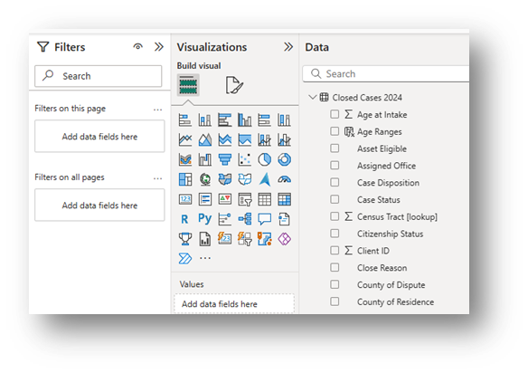
- Build Visuals in the Report View screen
- There are Filter, Build, and Data panes in the Report View screen.
Visual options appear in the Build pane.
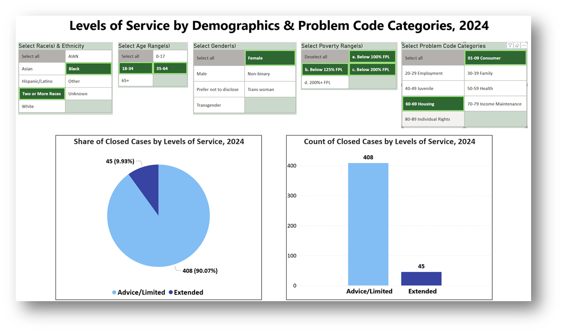
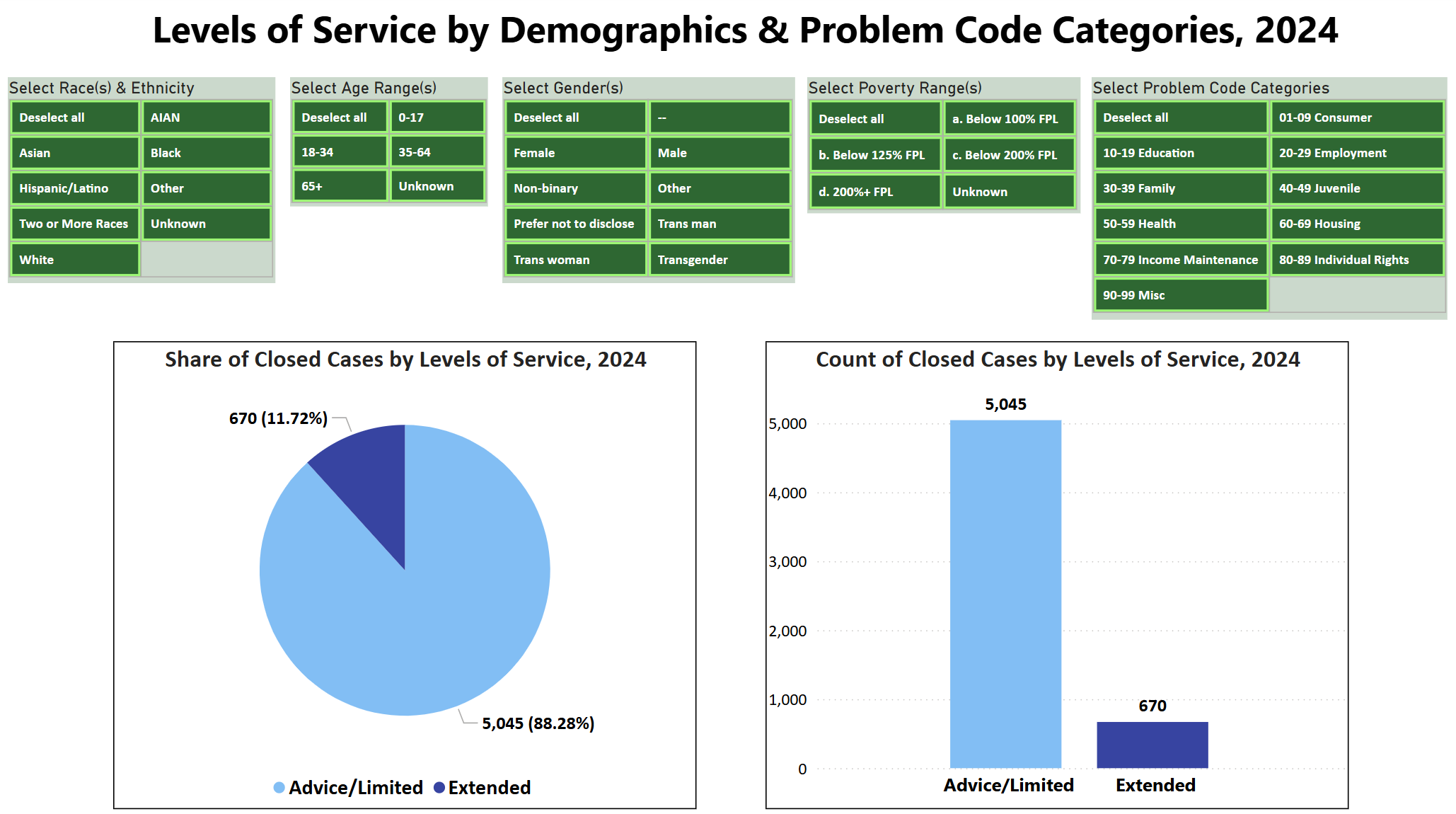
You may try different visuals, but for Comparison Analyses, try either the Pie, Stacked Column, or 100% Stacked Column charts. This example shows the Pie & Stacked Column charts.
- Build Pie Chart: Click on the Pie Chart Icon and it will appear in your Report View.
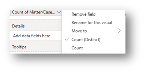
Adding Number of Cases to Chart: Drag Matter/Case ID into the Values box in the Build Pane. Click on > next to the field and change the Summarization to Count (Distinct).
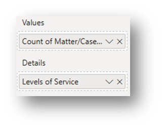
Adding Levels of Service to Chart: Drag the newly created Levels of Service data into the Details box in the Build Pane.
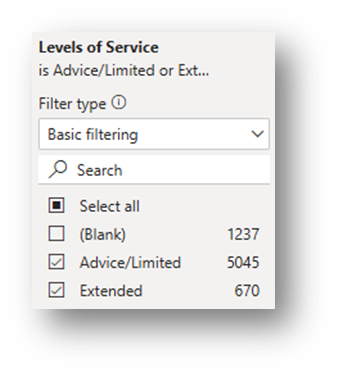
Change Filters (in the Filter Pane) to Exclude Blank Levels of Service: Click on the downward arrow next to Levels of Service and change the filter so (Blank) is not included and only Advice/Limited & Extended show.
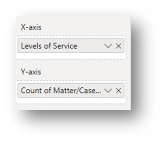
- Build Stacked Column Chart: Click on the Stacked Column Chart Icon and it will appear in your Report View. The following steps are similar to the Pie Chart instructions above except that Levels of Service goes into the X-axis and the distinct count of cases goes into the Y-axis.
- Adding Number of Cases to Chart: Drag Matter/Case ID into the Y-axis box in the Build Pane. Click on > next to the field and change the Summarization to Count (Distinct).
- Adding Levels of Service to Chart: Drag the newly created Levels of Service data into the X-axis box in the Build Pane.
Change Filters (in the Filter Pane) to Exclude Blank Levels of Service: Click on the downward arrow next to Levels of Service and change the filter so (Blank) is not included and only Advice/Limited & Extended show.
- Pie Chart Suggested Formatting Changes (in the Visualizations Format Pane):
- Legend (Visual Section): Turn Title off. Change the positioning and font.
- Slices (Visual Section): Colors may be changed.
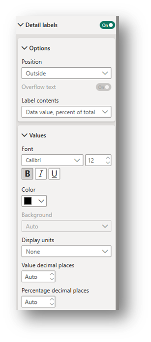
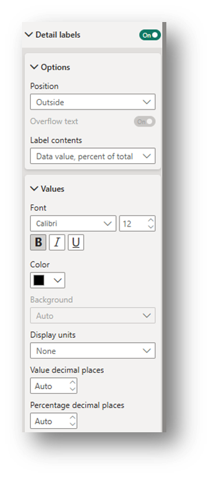
Detail Labels (Visual Section): Toggle on. Under the Options drop-down, change the position and decide which label contents to include. Under the Values drop down, change the font and display units. Select None for Display units to have the exact number appear in the label.
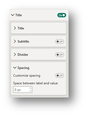
- Title (General Section): Edit the text of the Title and change the font size, coloring, and positioning. In the Spacing drop-down, change the Space between label and value to 0 px.
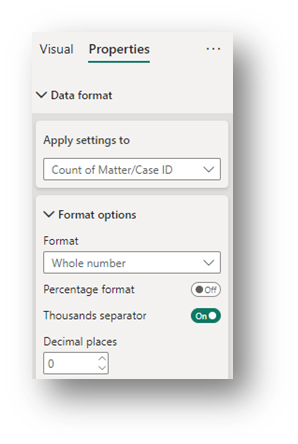
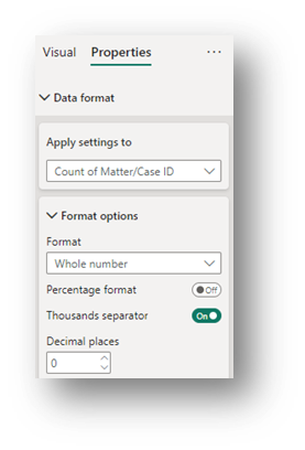
- Data Format (General Section): In the Properties section of the Format Pane, under the Data format drop-down, change Apply settings to Count of Matter/Case ID, change Format to Whole Number and turn on the Thousand separator. Doing this will show the numbers in easier-to-read format.
- Stacked Column Chart Suggested Formatting Changes (in the Visualizations Format Pane):
- X-axis (Visual Section): Turn Title off. Change the font of the Values (Levels of Service) under the Values subsection.
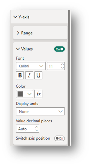
- Y-axis (Visual Section): Turn Title off. Change the font and/or Display Units of the Values (count of cases) to None under the Values subsection.
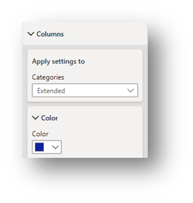
- Columns (Visual Section): Toggle between Categories (Advice/Limited and Extended) to change each category’s color.
- Detail Labels (Visual Section): Toggle on. Under the Options drop-down, change the position and decide which label contents to include. Under the Values drop down, change the font and display units. Select None for Display units to have the exact number appear in the label
- Title (General Section): Edit the text of the Title and change the font size, coloring, and positioning. In the Spacing drop-down, change the Space between label and value to 0 px.
- Data Format (General Section): In the Properties section of the Format Pane, under the Data format drop-down, change Apply settings to Count of Matter/Case ID, change Format to Whole Number and turn on the Thousand separator. Doing this will show the numbers in easier-to-read format.
- There are Filter, Build, and Data panes in the Report View screen.
- Add Slicers in so that you can see the Levels of Service comparisons by varying demographic characteristics and legal problems.
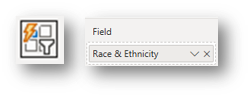
- Insert a Button Slicer.
Drag a field to the Field box.
- In the Format-Visual pane, the following formatting is suggested, but there are many more options in addition to the ones highlighted here:
- Slicer settings drop-down: Under Selection, Toggle on Show “Select all” option.
- Layout drop-down: Select Grid Arrangement and, depending on the number of options, adjust the Max rows shown and Columns shown.
Callout values drop-down: Adjust the formatting for the Default state and the Selected state so that it’s clear which option(s) are selected to filter the visuals.
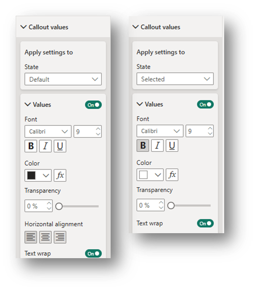
Buttons drop-down: Adjust the formatting for the Default state and the Selected state so that it’s clear which option(s) are selected to filter the visuals. Change the Padding to Narrow for all states.
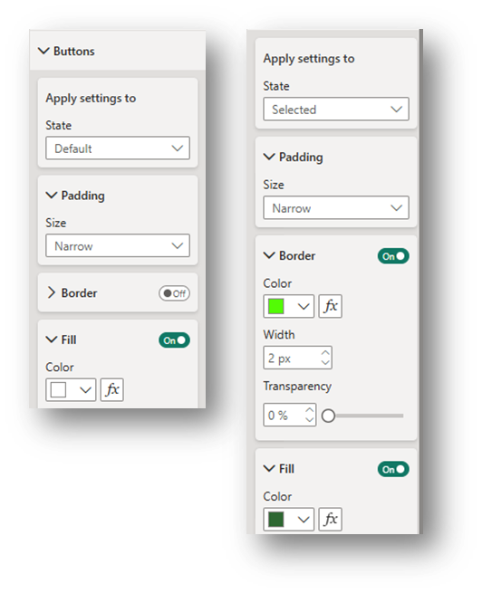
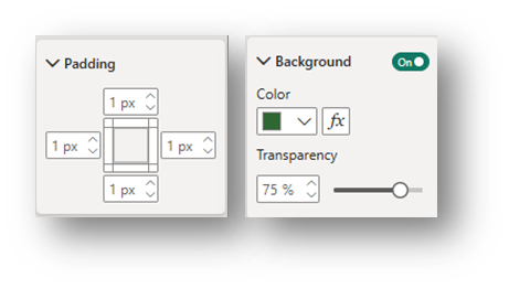
- In the Format-General pane, the following formatting is suggested, but there are many more options in addition to the ones highlighted here:
- Padding drop-down: Make all padding measures 1 px.
- Title drop-down: Toggle the Title to on, edit text to indicate the slicer’s topic, and change the font as preferred. Under Spacing, change Space below title to 2 px.
Effects drop-down: Toggle the Background to on and adjust the background color.
- To create additional slicers: Copy the slicer created and simply change the field entered in the Field box. Make sure to change each slicer’s title. Also, adjust the number of rows if needed.
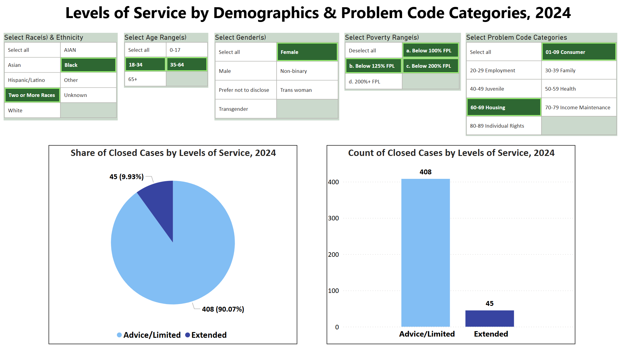
- Use Slicers together to see how Levels of Service Change
- The top visual shows all data included while the bottom visual shows the results for when all five slicers have selections activated.
Related Questions You May Ask
- How do the number and demographics of those receiving limited services or extended services compare to the demographics of the eligible population?
- How do the legal problems of those receiving limited services or extended services vary, especially for specific groups?
- How do the number and demographics of those achieving positive outcomes versus those not achieving positive outcomes compare to the demographics of the eligible population?
- How do the legal problems of those achieving positive outcomes versus those not achieving positive outcomes vary, especially for specific groups?
- How do the number, demographics, and legal problems of those served by staff versus those served by pro bono volunteers vary, especially for specific groups?