
Trend
Description
Definition: Trend analysis examines changes over time to identify patterns, spikes, or dips in client conditions or service needs.
Purpose: Tracks improving and/or worsening conditions, progress or regress, and emerging issues.
Examples:
- Monitoring increases in housing-related cases over five years.
- Tracking the seasonal variation of client intakes.
Key Insight: Analyze trends over a five-year period (or longer when possible). Unexpected changes, such as spikes or dips, may confirm expectations or raise new questions about whether proactive steps are necessary.
Example Data Question
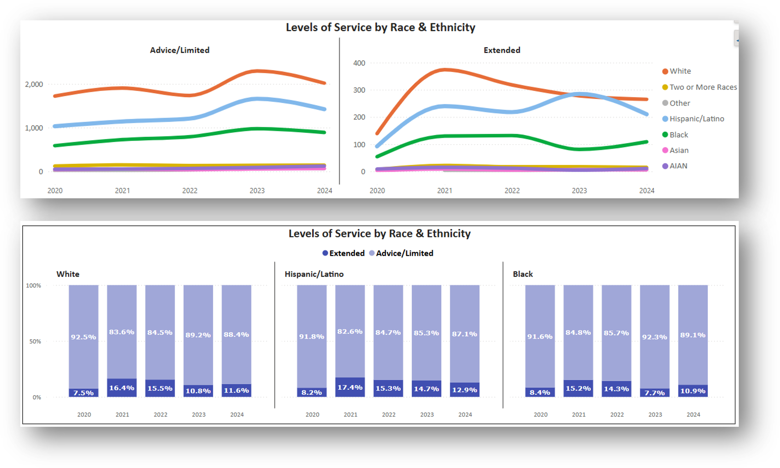
How have the Race and Ethnicity of clients receiving Advice/Limited Services and Extended Services changed over the last five years?
Recreate This Analysis
Data Sources
Closed Case data from your case management system:
- Fields:
- Demographics about which you are curious, such as Age at Intake, Gender, Race, Ethnicity, With Disabilities, Veteran, Percentage of Poverty, Number in Household, Citizenship Status, Language, Living Arrangement, County, etc.
- Dates: Date of Earliest, Intake Date, Prescreen Date, Open Date, Close Date, Date of Rejection, and Date of Birth (for use in an age-related formula).
- Case Information: Legal Problem Code, Problem Code Categories, Close Reason, Rejection Reason, Disposition, Intake Type, etc.
- Filters/Report Structure:
- Date Filters: Close Date in the last five years.
- Exclude/Filter Out: Test or fake cases and clients and duplicate cases using whichever fields your organizations uses to identify these cases and clients, such as Rejection Reason, Client Name, Case Status, Funding Code, etc. And cases with Rejection Reasons entered or with Close Reasons indicating no service provided (ex: R-Rejected, X-Error).
- Include: Cases that were closed with service (not rejected).
- One Row/Record Per Case: Ensure that downloaded data includes just one record (one row) per case. If necessary, text join fields that cause more than one row/record per case.
- Export Format:
If downloading from LegalServer, it is recommended that report results are exported as CSV files (an option that may be set up under Additional Display Format – remember to check Headers in First Row) and saved as Excel files to avoid formatting issues, particularly related to date fields.
Example Analyses Steps
- Download data from your case management system (CMS), use an API link to connect to data in your CMS, or connect to your CMS data directly via an ODBC connection or other method.
- Open Microsoft Power BI and select Excel as your data source.

- Connect to the CMS downloaded data file (from step 1), click the check box next to the tab name and click on Load.
- Save your Power BI file.
- Create New Columns
- The following New Columns create categories that are helpful for analysis.
Click on the name of your data file in the Data pane and either right click to select New Column or select the New Column button from the Table Tools ribbon across the top.
- Copy these formulas (over “Column = in the formula bar) into new columns (make sure to update the formula references so that they are pointing to the correct fields in your data).
- To change field references, highlight the field references in these formulas from opening single quote to closing right bracket (example: ‘Closed Cases 2020-2024'[Percentage of Poverty]), enter a single quote and a list of the fields in your table should appear from which you can choose.
- Click on the green check box next to the formula bar to verify the formulas are working and to create the new columns.
- Add these measures before creating visuals.
- Race Formula:
Race Formula = SWITCH(TRUE(),
'Closed Cases 2020-2024'[Race] = "Black or African American", "Black", 'Closed Cases 2020-2024'[Race] = "American Indian or Alaska Native", "AIAN",
OR('Closed Cases 2020-2024'[Race] = "Other", 'Closed Cases 2020-2024'[Race] = "Native Hawaiian or other Pacific Islander"), "Other",
OR('Closed Cases 2020-2024'[Race] = "", 'Closed Cases 2020-2024'[Race] = "Prefer not to disclose"), "Unknown",
'Closed Cases 2020-2024'[Race]) - Ethnicity Formula (for organizations that also have a HUD Ethnicity field):
Ethnicity Formula = IF ( OR ( 'Closed Cases 2020-2024'[Ethnicity] = "Hispanic",
'Closed Cases 2020-2024'[HUD 9902 Ethnicity] = "Latino/Hispanic" ), "Hispanic/Latino",
IF ( OR ( 'Closed Cases 2020-2024'[Ethnicity] = "Non-Hispanic",
'Closed Cases 2020-2024'[HUD 9902 Ethnicity] = "Non-Latino/Non-Hispanic" ),
"Non-Hispanic/Non-Latino",
IF ( OR ( AND ( 'Closed Cases 2020-2024'[Ethnicity] = ""
'Closed Cases 2020-2024'[HUD 9902 Ethnicity] = "" ),
'Closed Cases 2020-2024'[HUD 9902 Ethnicity] = "Chose not to respond" ), "Unknown",
IF ( 'Closed Cases 2020-2024'[HUD 9902 Ethnicity] <> "",
'Closed Cases 2020-2024'[HUD 9902 Ethnicity], 'Closed Cases 2020-2024'[Ethnicity] ) ) ) ) - Race & Ethnicity Formula:
Race & Ethnicity = IF ('Closed Cases 2020-2024'[Ethnicity Formula] = "Hispanic/Latino",
"Hispanic/Latino",
IF ( OR ('Closed Cases 2020-2024'[Ethnicity Formula] = "",
'Closed Cases 2020-2024'[Ethnicity Formula] = "Non-Hispanic/Non-Latino"),
'Closed Cases 2020-2024'[Race Formula],
BLANK() ))
i.This formula combines the previous two to pull all Hispanic/Latino clients of any race into one category and all Non-Hispanic/Non-Latino clients into their Race categories. It allows for comparison of race and ethnicity in one visual. Levels of Service:
Levels of Service =
IF ( LEFT('Closed Cases 2020-2024'[Close Reason], 1) IN {"A", "B"}, "Advice/Limited",
IF ( LEFT('Closed Cases 2020-2024'[Close Reason], 1) IN {"F", "G", "H", "I", "K", "L"},
"Extended",
BLANK() ))
- The following New Columns create categories that are helpful for analysis.
- Build Visuals in the Report View screen
- There are Filter, Build, and Data panes in the Report View screen.
- Visual options appear in the Build pane.
You may try different visuals, but for trend analysis, try either the Line, Stacked Column, or 100% Stacked Column charts. This example shows The Line & 100% Stacked Column charts.
Build Line Chart: Click on the Line Chart Icon and it will appear in your Report View.
- Adding Year to Chart: In the Data Pane, click on the downward pointing arrow next to your data file name to be able to see all the fields in your file. Click on > next to Close Date to open up the Date Hierarchy. Click again on > next to the Date Hierarchy to see Year, Quarter, Month, Day. Drag Year into the X-axis box in the Build Pane.
- Adding Number of Cases to Chart: Drag Matter/Case ID into the Y-axis box in the Build Pane. Click on > next to the field and change the Summarization to Count (Distinct).
- Adding Race & Ethnicity to Chart: Drag the newly created Race & Ethnicity column data into the Legend Box in the Build Pane.
- Adding Levels of Service to Chart: Drag the newly created Levels of Service column data into the Small Multiples box in the Build Pane.
- Change Filters (in the Filter Pane):
- Excluding Blank & Unknown Race & Ethnicity: Click on the downward arrow next to Race & Ethnicity is (All) and change the filter so neither Blank nor Unknown are not included.
- Show Only Advice/Limited & Extended: Levels of Service is (All) and change the filter so that only Advice/Limited & Extended show.
- Suggested Formatting Changes (in the Format Pane):
- Add Border: Under Size and style, click Visual border to on.
- Title: Edit the text of the Title and change the font size, coloring, and positioning.
- X-axis: Turn Title off. Change the font of the Values (Years) under the Values subsection.
- Y-axis: Turn Title off. Change the font and/or Display Units of the Values (count of cases) under the Values subsection. Note that when the volume is different (as it likely will be between Advice/Limited Service cases and Extended Service cases, you may want the line charts to have different Y-axis ranges. Under Y-axis-Range, turn Shared y-axis Off and turn Scale to fit on.
- Legend: Turn Title off. Change the positioning and font.
- Small Multiples: Change the number of rows to 1.
- Lines: You may change the line style, width, color for each line by selecting each Race & Ethnicity category in the Apply setting to Series drop down and making selections.
- Data Format: In the Properties section of the Format Pane, under Data format, change Apply settings to Count of Matter/Case ID, change Format to Whole Number and turn on the Thousand separator. Doing this will show the numbers in easier to read format when viewers hover over any point on the chart to see the Tooltips information.
- Legend Order: To sort the Race & Ethnicity categories in the legend in descending order, click on the three-dot ellipsis at the top right corner of the chart to open up More Options. Under Sort Legend, select Sort descending.
- Adding Year to Chart: In the Data Pane, click on the downward pointing arrow next to your data file name to be able to see all the fields in your file. Click on > next to Close Date to open up the Date Hierarchy. Click again on > next to the Date Hierarchy to see Year, Quarter, Month, Day. Drag Year into the X-axis box in the Build Pane.
Build 100% Stacked Column Chart: Click on the 100% Stacked Column Chart Icon and it will appear in your Report View.
- Adding Year to Chart: In the Data Pane, click on the downward pointing arrow next to your data file name to be able to see all the fields in your file. Click on > next to Close Date to open up the Date Hierarchy. Click again on > next to the Date Hierarchy to see Year, Quarter, Month, Day. Drag Year into the X-axis box in the Build Pane.
- Adding Number of Cases to Chart: Drag Matter/Case ID into the Y-axis box in the Build Pane. Click on > next to the field and change the Summarization to Count (Distinct).
- Adding Race & Ethnicity to Chart: Drag the newly created Race & Ethnicity column data into the Legend Box in the Build Pane.
- Adding Levels of Service to Chart: Drag the newly created Levels of Service column data into the Small Multiples box in the Build Pane.
- Change Filters (in the Filter Pane):
- Top 3 Race & Ethnicity Categories Excluding Blanks & Unknown: Click on the downward arrow next to Race & Ethnicity is (All) and change the filter so neither Blank nor Unknown are not included. Drag the Race & Ethnicity field over into another Add data fields here box in the Filter Pane under Filters on this visual. Change the Filter Type to Top 3 and enter Matter/Case ID in the By value box, changing it to Count (Distinct). Click on Apply Filter.
- Show Only Advice/Limited & Extended: Levels of Service is (All) and change the filter so that only Advice/Limited & Extended show.
- Top 3 Race & Ethnicity Categories Excluding Blanks & Unknown: Click on the downward arrow next to Race & Ethnicity is (All) and change the filter so neither Blank nor Unknown are not included. Drag the Race & Ethnicity field over into another Add data fields here box in the Filter Pane under Filters on this visual. Change the Filter Type to Top 3 and enter Matter/Case ID in the By value box, changing it to Count (Distinct). Click on Apply Filter.
- Suggested Formatting Changes (in the Format Pane):
- Add Border: Under Size and style, click Visual border to on.
- Title: Edit the text of the Title and change the font size, coloring, and positioning.
- X-axis: Turn Title off. Change the font of the Values (Years) under the Values subsection. Change the Type to Categorical to ensure that every year label appears.
- Y-axis: Turn Title off. Change the font and/or Display Units of the Values (count of cases) under the Values subsection.
- Legend: Turn Title off. Change the positioning and font.
- Small Multiples: Change the number of rows to 3 (or however many categories you allowed in the Top N filter).
- Columns: Change the colors for Served and Not Served categories under Apply settings to. You must select each Series (Advice/Limited and Extended) separately to change colors.
- Data Labels: Turn Data Labels on. Leave Apply setting to Series All. Turn Detail (under Data Labels) on. Change the font (you may have to make the font very small for it to show up in the visual) and change the Value decimal places to 1.
- Data Format: In the Properties section of the Format Pane, under Data format, change Apply settings to Count of Matter/Case ID, change Format to Whole Number and turn on the Thousand separator. Doing this will show the numbers in easier to read format when viewers hover over any point on the chart to see the Tooltips information.
- Category Orders: To have Extended appear lowest in each column, click on the three-dot ellipsis at the top right corner of the chart to open up More Options. Under Sort legend, select Sort descending. To have Race & Ethnicity appear in descending order by case volume, click on the three-dot ellipsis at the top right corner of the chart to open up More Options. Under Sort small multiples, select Count of Matter/Case ID and Sort descending.
- Adding Year to Chart: In the Data Pane, click on the downward pointing arrow next to your data file name to be able to see all the fields in your file. Click on > next to Close Date to open up the Date Hierarchy. Click again on > next to the Date Hierarchy to see Year, Quarter, Month, Day. Drag Year into the X-axis box in the Build Pane.


Related Questions You May Ask
- How have the number, demographics, and legal problems of those receiving limited services or extended services changed over time?
- How have the number, demographics, and legal problems of those achieving positive outcomes versus those not achieving positive outcomes changed over time?
- How has the number, demographics, and legal problems of those served by staff versus those served by pro bono volunteers changed over time?