
Geographic Concentration
Description
Definition: Geographic concentration analysis compares high or low concentrations of multiple variables to understand how location impacts client conditions. It often uses location quotients (LQs) to quantify concentrations.
Purpose: Highlights areas where services could be ramped up to better meet client need, and pinpoints "hotspots" or regions with specific emerging needs or resources.
Examples:
- Identifying neighborhoods with higher-than-expected concentrations of eviction cases.
- Comparing service levels with poverty concentrations across regions.
Key Insight: Concentration analysis reveals the interplay between variables and locations, helping you understand how geographic factors influence service needs or outcomes.
Example Data Question
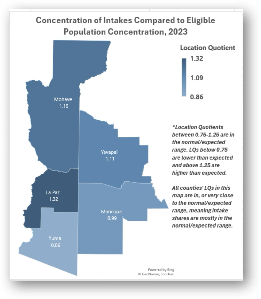
How does the proportion of people from different parts of our service area who request assistance compare to the proportion of eligible people in those different parts of our service area (e.g. Are there any counties in the Community Legal Services of Arizona’s service area from which we are getting disproportionately more or fewer intakes than we expect?)
Recreate This Analysis
Data Sources
Eligible population data from the U.S. Census American Community Survey at Census Bureau Data:
- S1701 Poverty Status in the Past 12 Months
- Contents: Poverty (<100%) counts and percentages by age, sex, race, educational attainment, employment status, and work experience, and population totals by poverty at various levels (including <125%, <200%, etc.).
- Data Limitation: This table does not provide detailed demographic characteristics about people at poverty levels other than the <100% poverty level population, but it does have data for all 5 counties, including counties with small populations.
Intake data from your case management system:
- Fields:
- Demographics about which you are curious, such as Age at Intake, Gender, Race, Ethnicity, With Disabilities, Veteran, Percentage of Poverty, Number in Household, Citizenship Status, Language, Living Arrangement, County, etc.
- Dates: Date of Earliest, Intake Date, Prescreen Date, Open Date, Close Date, Date of Rejection, and Date of Birth (for use in an age-related formula).
- Case Information: Legal Problem Code, Problem Code Categories, Close Reason, Rejection Reason, Disposition, Intake Type, etc.
- Filters/Report Structure:
- Date Filters: Date of Earliest in last year, or Intake Date or Prescreen Date in last year.
Exclude/Filter Out: Test or fake cases and clients and duplicate cases using whichever fields your organizations uses to identify these cases and clients, such as Rejection Reason, Client Name, Case Status, Funding Code, etc. - Include: Cases that were closed with service, rejected without service, or remain open.
- One Row/Record Per Case: Ensure that downloaded data includes just one record (one row) per case. If necessary, text join fields that cause more than one row/record per case.
- Date Filters: Date of Earliest in last year, or Intake Date or Prescreen Date in last year.
- Export Format:
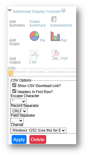
If downloading from LegalServer, it is recommended that report results are exported as CSV files (an option that may be set up under Additional Display Format – remember to check Headers in First Row) and saved as Excel files to avoid formatting issues, particularly related to date fields.
Example Analyses Steps
Part 1: Collecting External U.S. Census Data:
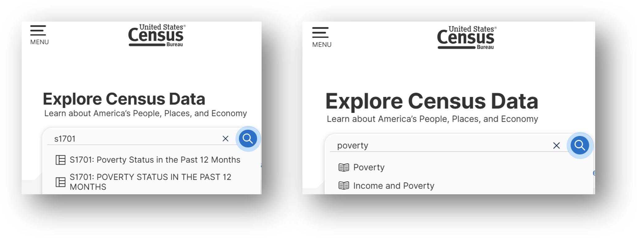
- Open the Census Bureau's Explore Census Data website.
- Type "s1701" in the search bar for our example.
- In the future, if you know you need the S1701 Poverty Status in the Past 12 Months table, type "s1701" in the search bar. If you do not know the table name, you may enter a search term, such as "poverty" to be taken to a list of relevant tables, including S1701.
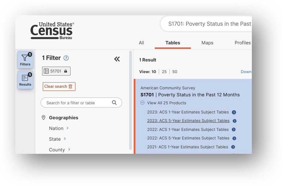
- Click on the S1701 table.
- Click on the S1701 table.
- Click on +View All 25 Products under the table name.
- Click on 2023: ACS 5-Year Estimates Subject Tables.
- If your geographies have populations over 65,000 you may stay with the default 1-Year Estimates, which provide more current, but less reliable data or you may use 5-Year Estimates, which provide less current, but more reliable 5-year averages. If some or all of your geographies have fewer than 65,000 people (like La Paz County, AZ in this example), you must select 5-Year Estimates.
- For information about choosing 5-year or 1-year estimates, refer to Using 1-Year or 5-Year American Community Survey Data.
- Under Geographies in the far-left filter panel, select a geographic level, and click on it (In this example: geographic level is County).
- Select a state (Arizona in this example).
- Click on all the counties you need added (5 Arizona counties were selected in this example: La Paz, Maricopa, Mohave, Yavapai, & Yuma).
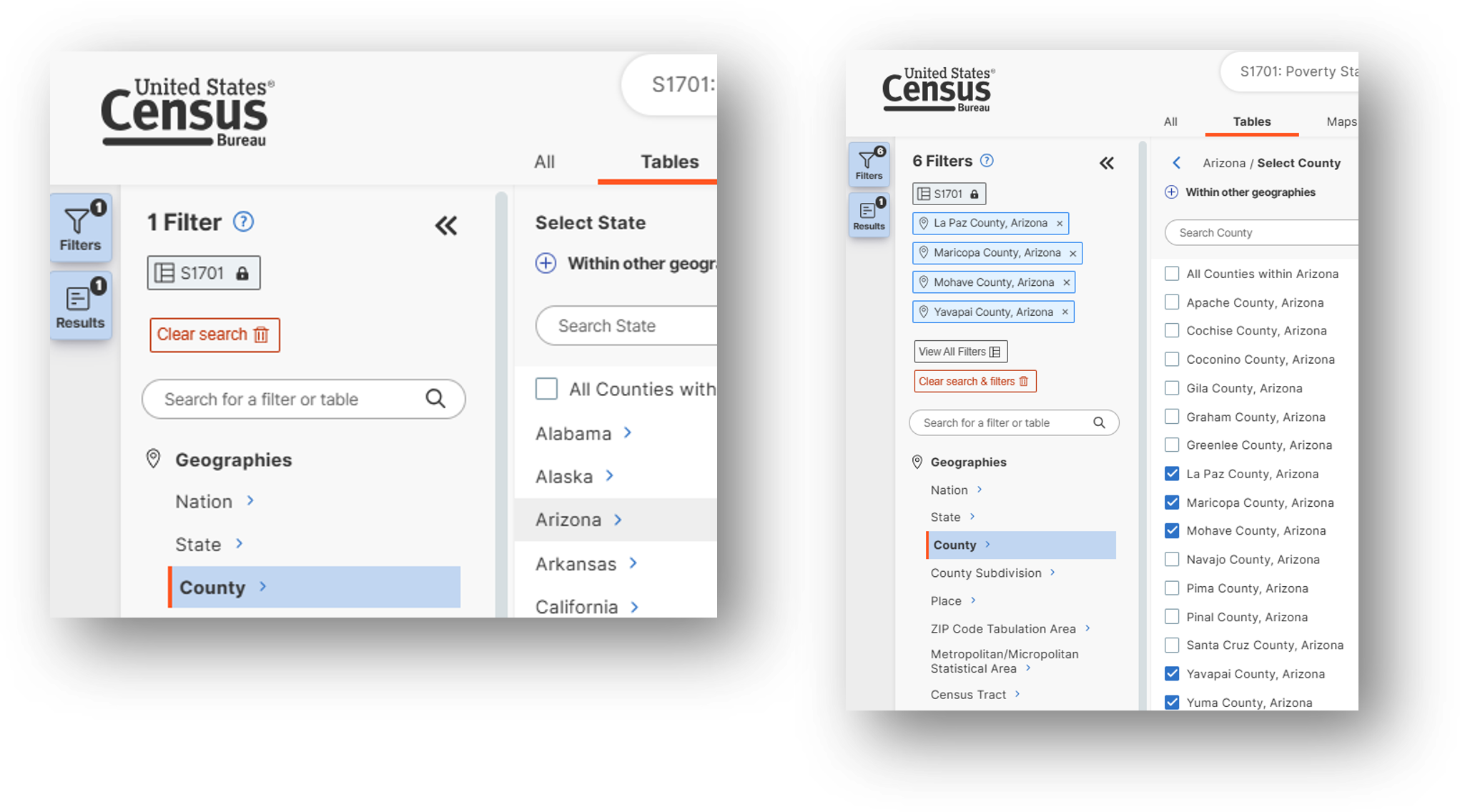
- Once all geographies have been added, click on close panel << button.
- Verify that 5-Year Estimates are still indicated under the table name in the top left and if instead 1-Year Estimates are indicated, click on the Dataset button and reselect 2023 5-Year Estimates (to ensure that La Paz county data are included in this example).
- To avoid downloading the Margin of Error data, click on the Margin of Error button along the top ribbon before downloading the data.
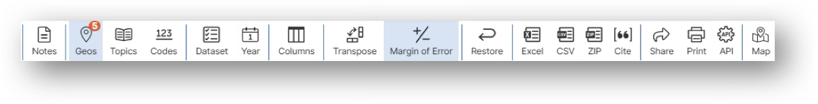
- Click on the Excel button along the table ribbon to download an Excel version of the table or the CSV button to download a CSV version of the table. If you do not see the Excel or CSV buttons in the top ribbon, click on More Tools at the far right of the ribbon.
- The Excel version is formatted to be more user-friendly and includes an Information tab that provides table details and notes whereas the CSV version includes only unformatted data.
- The CSV version can be easier to work with when you are downloading data for more than one geography as long as they are saved as Excel files after being downloaded in CSV format.
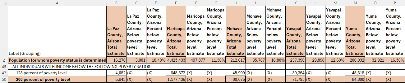
- Open the data file:
- If the numbers downloaded in text format, highlight the relevant cells, right click, and select Convert to Number.
- In the Calculation steps below, focus on the top row, Population for whom poverty status is determined (which is the total poverty and non-poverty population combined) and the 200 percent of the poverty level row.
Part 2: Collecting Internal Case Management System Data:
- Download data from your case management system (CMS), use an API link to connect to data in your CMS, or connect to your CMS data directly via an ODBC connection or other method.
- Make sure to include intakes that remain open, that were rejected, and that were closed (either in the year they were opened or later).
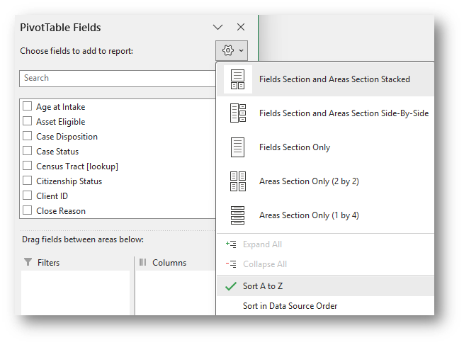
- Create PivotTable
- Click Insert along the top ribbon, then click on PivotTable.
- You will see a blank PivotTable.
- Sort the fields in the PivotTable Fields window, by clicking on the Gear Icon, and selecting Sort A to Z.
- Add the Matter/Case ID (or Case Number) field to the Values window and make sure the calculation is Count.
- If you see Sum of Matter/Case ID, click on the drop down, select Value Field Settings, and change the calculation type to Count.
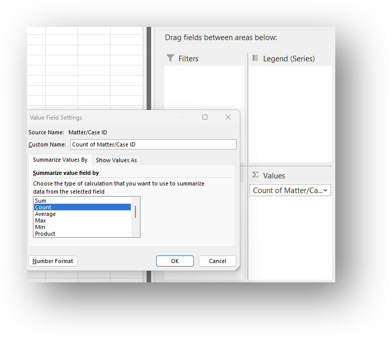
- If you see Sum of Matter/Case ID, click on the drop down, select Value Field Settings, and change the calculation type to Count.
- Drag County of Residence into the Rows window.
- Assuming you do not need to map intakes from counties outside of your service area, you may click on the Row Labels drop-down in the PivotTable and uncheck all but the service area counties.
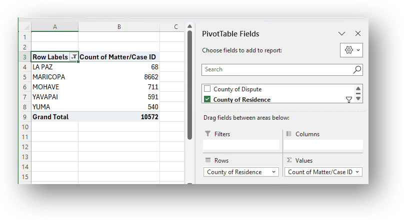
- Assuming you do not need to map intakes from counties outside of your service area, you may click on the Row Labels drop-down in the PivotTable and uncheck all but the service area counties.
Part 3: Combining External & Internal Data:
- Perform calculations:
- Copy the county names (making sure to include the word “County” followed by a comma and the name of the state, which is important for the mapping steps below) into a new calculation table to the right of the downloaded data.
- Copy the Less than 200 percent of poverty level numbers from the U.S. Census data previously downloaded for each county into the new table.
- Calculate each county’s Share of Intakes and Share of the <200% Poverty Population by dividing each county's number by the service area's total number.
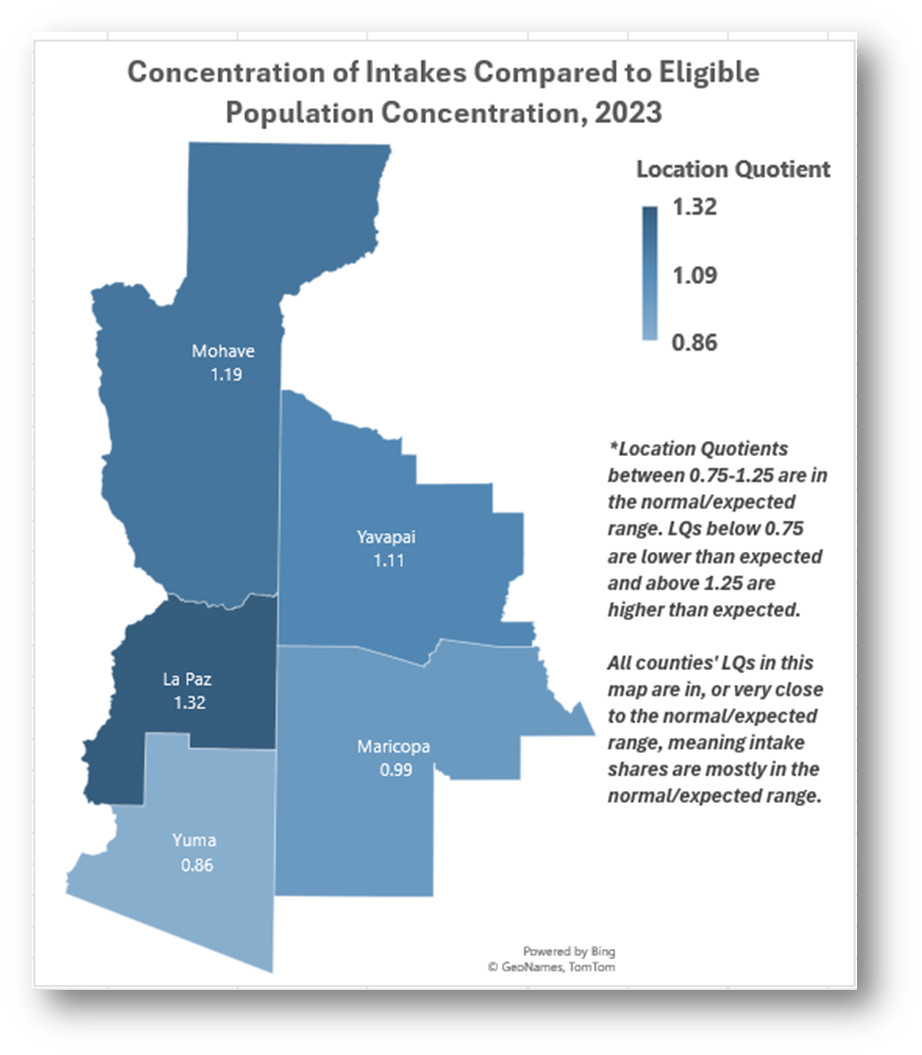
- Calculate each county’s Location Quotient (LQ) by dividing the Share of Intakes by its Share of the <200% Poverty Population.
- Note that LQs in the range of 0.75-1.25 are generally considered in the normal/expected range, thus in this example, all counties in the service area are within the normal range, except for La Paz, from which a slightly higher than expected share of intakes were received in 2023, but its LQ is still very close to the normal/expected range.
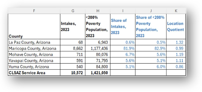
- Note that LQs in the range of 0.75-1.25 are generally considered in the normal/expected range, thus in this example, all counties in the service area are within the normal range, except for La Paz, from which a slightly higher than expected share of intakes were received in 2023, but its LQ is still very close to the normal/expected range.
- Create map:
- Highlight the County column and the Location Quotient column and click on Insert-Maps-Filled Maps.
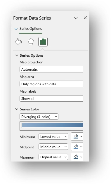
- Right-click on the map and select Format Data Series
- Leave Map projection Automatic but consider changing Map area to Only regions with data. Change Map labels to Show all.
- Change Series Color to Diverging (3-color), varying the colors more significantly when most LQs are below 0.75 or above 1.25 and less significantly when most LQs are in the normal range.
- With the chart selected, click on Chart Elements (green Plus Sign in the top right corner) and click on the check box next to Data Labels. County LQs will appear.
- Edit the Title: Click on the existing title and type over it. You may change the font size and make it bold.
- Add a note explaining whether the LQs outside of or within the normal/expected range.
Related Questions You May Ask
- Does the geographic concentration of intakes align with the eligible population or specific demographics in my service area?