
Geographic Distribution
Description
Definition: Geographic distribution analysis examines how people, problems, or resources are distributed across a service area. Dividing the area into smaller subregions reveals spatial patterns.
Purpose: Identifies spatial dimensions of your organization’s reach and client needs.
Examples:
- Mapping cases by zip code.
- Showing distribution of foreclosure cases across counties.
Key Insight: Spatial patterns provide opportunities to learn about the geographic dimensions of your services and client needs, highlighting where interventions may be needed.
Example Data Question
Where do people live who speak Spanish and request assistance from my organization?

Recreate This Analysis
Data Sources
Intake data from your case management system:
- Fields:
- Demographics about which you are curious, such as Age at Intake, Gender, Race, Ethnicity, With Disabilities, Veteran, Percentage of Poverty, Number in Household, Citizenship Status, Language, Living Arrangement, County, etc.
- Dates: Date of Earliest, Intake Date, Prescreen Date, Open Date, Close Date, Date of Rejection, and Date of Birth (for use in an age-related formula).
- Case Information: Legal Problem Code, Problem Code Categories, Close Reason, Rejection Reason, Disposition, Intake Type, etc.
- Filters/Report Structure:
- Date Filters: Date of Earliest in last year, or Intake Date or Prescreen Date in last year.
- Exclude/Filter Out: Test or fake cases and clients and duplicate cases using whichever fields your organizations uses to identify these cases and clients, such as Rejection Reason, Client Name, Case Status, Funding Code, etc.
- Include: Cases that were closed with service, rejected without service, or remain open.
- One Row/Record Per Case: Ensure that downloaded data includes just one record (one row) per case. If necessary, text join fields that cause more than one row/record per case.
- Export Format:
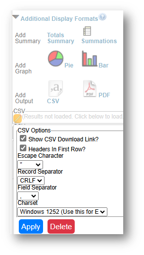
- If downloading from LegalServer, it is recommended that report results are exported as CSV files (an option that may be set up under Additional Display Format – remember to check Headers in First Row) and saved as Excel files to avoid formatting issues, particularly related to date fields.
Example Analyses Steps
- Download data from your case management system (CMS), use an API link to connect to data in your CMS, or connect to your CMS data directly via an ODBC connection or other method.
- Create Map
- Click Insert along the top ribbon, then click on PivotTable.
- Place the first PivotChart in a New Worksheet and rename it Charts.
- You will see a blank PivotTable.
- Sort the fields in the PivotTable Fields window, by clicking on the Gear Icon, and selecting Sort A to Z.
- Add the Matter/Case ID (or Case Number) field to the Values window and make sure the calculation is Count.
- If you see Sum of Matter/Case ID, click on the drop down, select Value Field Settings, and change the calculation type to Count.
- If you see Sum of Matter/Case ID, click on the drop down, select Value Field Settings, and change the calculation type to Count.
- Drag the Language field into the Filters window, click on the drop down next to Language above the PivotTable, and select Spanish.
Drag the County of Residence field in the Rows window. Click on the drop-down in the Row Labels cell of the PivotTable and deselect any counties you do not want to include (like Unknown, Blank, or counties Out of Service Area).
Copy PivotTable data (values only) into a calculation table to the right of the data, add the word “County” after the county name, followed by a comma and the state name. Also relabel the columns.
- Highlight your calculation table, click on Insert across the top ribbon, and select Maps-Filled Maps.
- Change the Map’s title by simply clicking on “Chart Title” and typing your preferred title.
- Right-click on a shaded county in the map and select Format Data Series.
- Leave Map projection Automatic but consider changing Map area to Only regions with data. Leave Map labels None.
- You may leave the Series Color as Sequential (2-color) or change it to Diverging (3-color) and you may change any of the colors.
- To add labels, click the green plus sign in the top right corner of the map and selec Data Labels in the Chart Elements box. To edit the Data Labels, select More Data Label Options to be taken to the Format Data Labels window.
- Check Category Name and Value and change the Number formatting if needed.
- Highlight any data label on the map and change the font from the font options across the top of the Home screen.
- Click Insert along the top ribbon, then click on PivotTable.


Related Questions You May Ask
- Where do people requesting assistance live, and how does this vary by demographics, legal problems, or intake methods?