
Trend
Description
Definition: Trend analysis examines changes over time to identify patterns, spikes, or dips in client conditions or service needs.
Purpose: Tracks improving and/or worsening conditions, progress or regress, and emerging issues.
Examples:
- Monitoring increases in housing-related cases over five years.
- Tracking the seasonal variation of client intakes.
Key Insight: Analyze trends over a five-year period (or longer when possible). Unexpected changes, such as spikes or dips, may confirm expectations or raise new questions about whether proactive steps are necessary.
Example Data Question
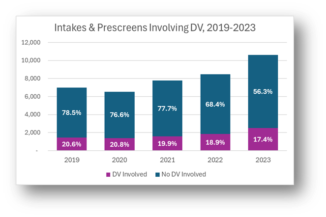
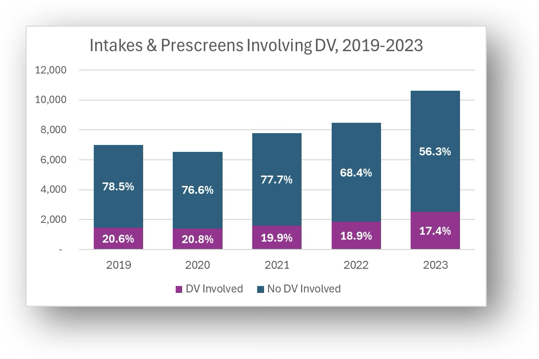
How have our intakes for cases involving domestic violence changed over the last 5 years?
Recreate This Analysis
Data Sources
Intake data from your case management system:
Fields:
- Demographics about which you are curious, such as Age at Intake, Gender, Race, Ethnicity, With Disabilities, Veteran, Percentage of Poverty, Number in Household, Citizenship Status, Language, Living Arrangement, County, etc.
- Dates: Date of Earliest, Intake Date, Prescreen Date, Open Date, Close Date, Date of Rejection, and Date of Birth (for use in an age-related formula).
- Case Information: Legal Problem Code, Problem Code Categories, Close Reason, Rejection Reason, Disposition, Intake Type, etc.
Filters/Report Structure:
- Date Filters: Date of Earliest in last year, or Intake Date or Prescreen Date in last year.
- Exclude/Filter Out: Test or fake cases and clients and duplicate cases using whichever fields your organizations uses to identify these cases and clients, such as Rejection Reason, Client Name, Case Status, Funding Code, etc.
- Include: Cases that were closed with service, rejected without service, or remain open.
- One Row/Record Per Case: Ensure that downloaded data includes just one record (one row) per case. If necessary, text join fields that cause more than one row/record per case.
Export Format:
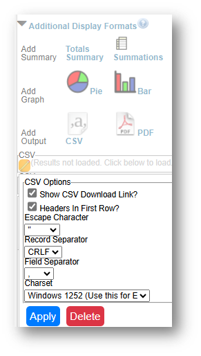
- If downloading from LegalServer, it is recommended that report results are exported as CSV files (an option that may be set up under Additional Display Format – remember to check Headers in First Row) and saved as Excel files to avoid formatting issues, particularly related to date fields.
Example Analyses Steps
- Download data from your case management system (CMS), use an API link to connect to data in your CMS, or connect to your CMS data directly via an ODBC connection or other method.
- Create Formulas in the downloaded data (using Excel in this example).
- The following formulas create categories that are helpful for analysis.
- Copy these formulas into cells in the far-right columns of your downloaded data (make sure to update the formula references so that they are pointing to the correct fields in your data).
- Add these formulas to all rows of data before creating pivot charts.
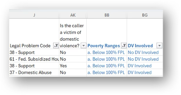
- Involving DV: =IF(AND(J2="",AI2=""),"Unknown",IF(OR(LEFT(J2,2)="37",AI2="Yes"),"DV Involved",IF(AND(LEFT(J2,2)<>"37",AI2="No"),"No DV Involved","Unknown")))
- Note that J2=Legal Problem Code& Ai2=Is the caller a victim of domestic violence?.
- This formula captures any intakes where Legal Problem Code=37 Domestic Abuse and/or any intakes for which the client indicated that domestic violence is involved.
- Poverty Ranges: =IF(AND(AC2=0,ISBLANK(X2)),"Unknown", IF(AND(AC2=0,NOT(ISBLANK(X2))),"a. Below 100% FPL", IF(AC2<100,"a. Below 100% FPL", IF(AC2<125,"b. Below 125% FPL",
- IF(AC2<200,"c. Below 200% FPL","d. 200%+ FPL")))))
- Note that AC2=Percentage of Poverty & X2=Types of Income.
- Because some databases enter Poverty=0% when Income is blank, this formula ensures that you do not overcount those who actually have $0 income and 0% Poverty Level.
- Race Formula: =IF(AM2="Black or African American","Black", IF(AM2="American Indian or Alaska Native","AIAN", IF(OR(AM2="Other",AM2="Native Hawaiian or other Pacific Islander"),"Other", IF(OR(AM2="",AM2="Prefer not to disclose"),"Unknown", AM2))))
- Note that AM2=Race.
- This formula is written so that the race categories match the MDAT PUMS data downloaded earlier.
- Ethnicity Formula: =IF(OR(AN2="Hispanic",AO2="Latino/Hispanic"),"Hispanic/Latino", IF(OR(AN2="Non-Hispanic",AO2="Non-Latino/Non-Hispanic"),"Non-Hispanic/Non-Latino", IF(OR(AND(AN2="",AO2=""),AO2="Chose not to respond"),"Unknown", IF(AO2<>"",AO2,AN2))))
- Note that AN2=Ethnicity & AO2=HUD 9902 Ethnicity.
- This formula takes entries in both ethnicity-related fields and defines ethnicity as Hispanic/Latino, Non-Hispanic/Non-Latino, or Unknown.
- The following formulas create categories that are helpful for analysis.
- Create Pivot Table
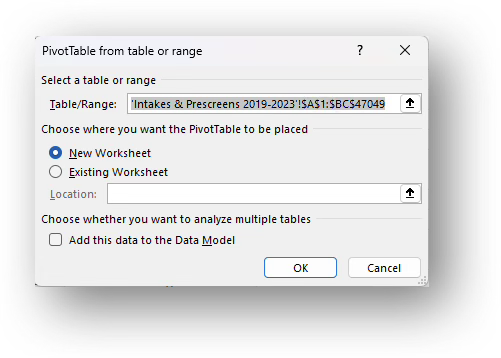
- Click Insert along the top ribbon, then click on PivotTable.
- Place the first PivotTable in a New Worksheet and rename it Charts.
If you create additional PivotTables or PivtoCharts, insert them into the same Charts worksheet.
- You will see a blank PivotTable.
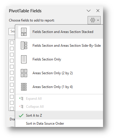
Sort the fields in the PivotTable Fields window, by clicking on the Gear Icon, and selecting Sort A to Z.
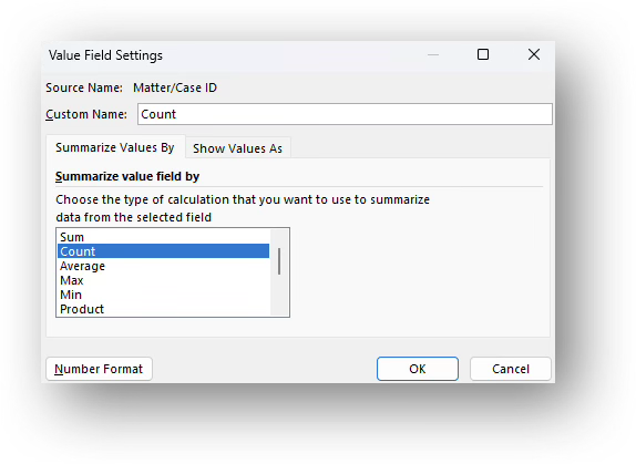
- Add the Matter/Case ID (or Case Number) field to the Values window, make sure the calculation is Count, and change its Custom Name to Count.
To change the Custom Name and verify the calculation type, click on the drop down next to the field in the Values window, select Value Field Settings, change the Custom Name on the Summarize Values by tab, and verify or change the calculation type on the Show Values as tab.
- Drag any of the fields you are interested in analyzing into the Columns window (DV Involved for this example) and Dates (Date of Earliest (Open, Intake, Prescreen for this example) into the Rows window and notice how the PivotTable updates.
Adjust the date parts that appear: Remove any date parts (Years, Quarters, Months, or Dates) that you do not need for your analysis. Often, all you need is Years, so you can simply drag the Quarters, Months, and Dates out of the Rows window.
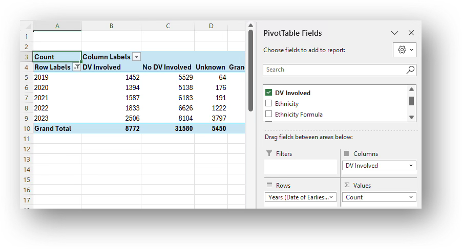
- Do Not Include Unknown or Blank Data: Click on the Column Labels filter drop-down in the PivotTable and unselect Unknown.
- There may be significant blank data when working with intakes and prescreens. You may want to leave the blank data in your charts, but hiding it provides the viewers insight into the share of intakes/prescreens by various characteristic among those for whom that characteristic is known. These known data percentages can serve as a good representation, or proxy estimate, for all those who requested assistance.
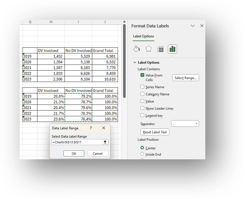
Copy the Values only of the PivotTable into cells to the right of the Pivot Table. Format the columns with numbers so that they have thousand separators. Create a table immediately below the copied data in which you calculate the percentage by category for each year.
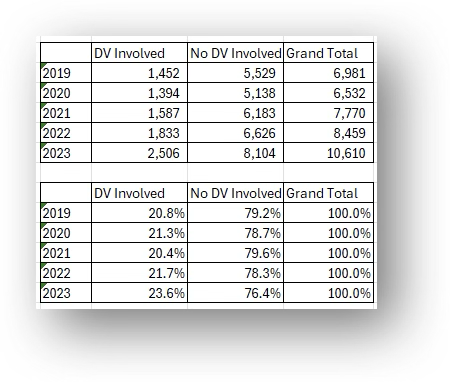
- Highlight the year column, the DV Involved (count), and the No DV Involved (count) columns and insert a Stacked Column chart.
Format the chart as you prefer. Here are the steps taken to change the original chart to this final version:
Insert Percentage Data Labels: With the chart selected, click on Chart Elements (green plus sign in the top right corner) and click on the check box next to Data Labels.
- Labels showing counts will appear. Right click on any label (for either DV Involved or No DV Involved) and select Format Data Labels.
- Unclick Values and click on Value from Cells and in the Data Label Range, select the Percent column for the same data series (for either DV Involved or No DV Involved) as the label you’ve highlighted.
- Repeat these steps until all data series have Percent labels for all data series.
- Change Colors: With the chart selected, click on Chart Design along the top ribbon and then click on Change Colors. If you don’t see a palette that you like, you may click on Page Layout along the top ribbon and select from among the Colors drop down. Alternatively, you may change the color for each category by right clicking on a column for each category and selecting an alternative Fill (for bars or columns) or Outline (for lines) color.
- Other Formatting Options:
- Edit the Title: Click on the existing title and type over it. You may change the font size and make it bold.
- Format the Legend: Right-click it and make selections in the Format Legend window.
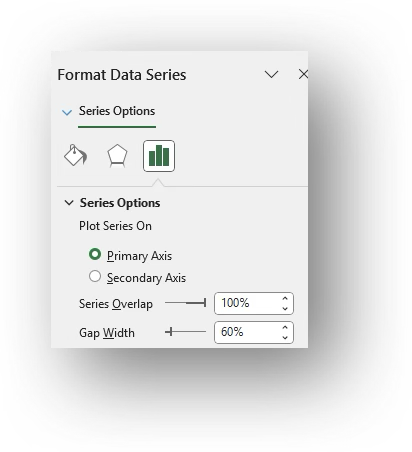
Widen Columns: Click on a column and in the Format Data Series window, shrink the Gap Width (suggested: 60%).
- Click Insert along the top ribbon, then click on PivotTable.