
Comparison
Description
Definition: Comparison analysis examines relationships between two or more variables to uncover insights about client conditions or data linkages.
Purpose: Highlights disparities, disproportionalities, differences, relationships, or conditions requiring further investigation.
Examples:
- Comparing service rates by gender or ethnicity.
- Analyzing links between poverty levels and case types.
Key Insight: When unexpected differences arise by demographics or legal problem, investigate to understand the data relationships and determine whether advocacy or services targeting multiple conditions are needed.
Example Data Question
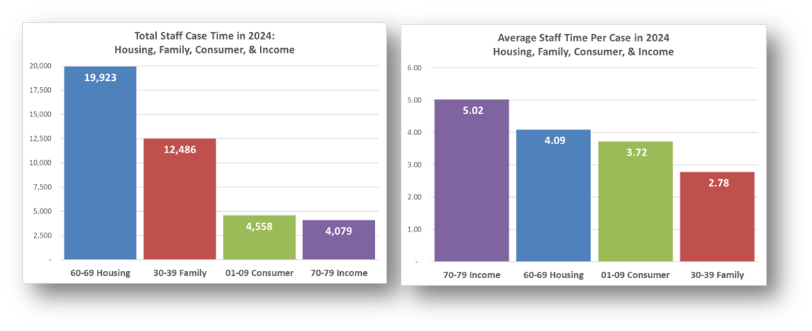
How did total staff case hours and average staff hours per case compare across Problem Code Categories last year?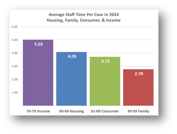
Recreate This Analysis
Data Sources
Timekeeping data from your case management system:
- Fields:
- Timekeeping fields: Date of Service, Hours, Activity Type, Activity Code, Advocate/User Type, Pro Bono Time
- Case Information: Matter/Case ID#, Legal Problem Code, Problem Code Categories, Close Reason, Rejection Reason, Disposition, etc.
- Demographics about which you are curious, such as Age at Intake, Gender, Race, Ethnicity, With Disabilities, Veteran, Percentage of Poverty, Number in Household, Citizenship Status, Language, Living Arrangement, County, State, Zip Code, etc.
- Filters/Report Structure:
- Date Filters: Date of Service in the last year.
- Exclude/Filter Out:
- Test or fake cases using whichever fields your organizations uses to identify these cases and clients, such as Rejection Reason, Client Name, Case Status, Funding Code, etc.
- Pro bono time by excluding any entries where Advocate/User Type=Pro Bono Advocate and making sure that Probono Time field is No or Null.
- Non-Case Time: Since this analysis is focused on case time, make sure the Matter/Case ID# is Not Empty.
- Attributes:
- Because Timekeeping reports can have a very large number or records and therefore take a long time to process and because the instructions below call for creating Crosstabs, once you’ve added all the fields you need, uncheck Show Tabular Format. Doing so will prevent the many thousands of records from appearing when the report is run, which should speed up processing time significantly. Note that the records will still in appear in the report’s Edit mode.
- Because Timekeeping reports can have a very large number or records and therefore take a long time to process and because the instructions below call for creating Crosstabs, once you’ve added all the fields you need, uncheck Show Tabular Format. Doing so will prevent the many thousands of records from appearing when the report is run, which should speed up processing time significantly. Note that the records will still in appear in the report’s Edit mode.
Example Analyses Steps
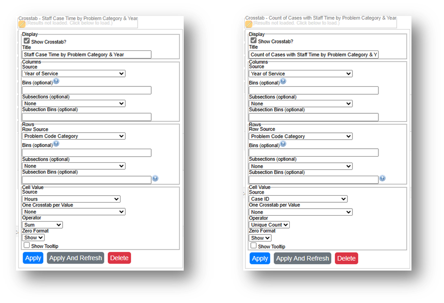
- To compare data across multiple years, create a new “Year of Service” Field by adding the Date of Service field a second time, formatting it to show Year Only, and renaming it from “Date of Service” to “Year of Service”. Then Add Year of Service to the Column Source.
- Create 2 Crosstab that show (1) Hours by Problem Code Category and (2) Unique Count of Cases by Problem Code Category.
- Staff Case Time by Problem Category: Select the new Year of Service field for Columns Source, select Problem Code Category for Row Source, and select Hours for Cell Value Source and Sum for Operator.
- Count of Cases with Staff Time by Problem Category: Select the new Year of Service field for Columns Source, select Problem Code Category for Row Source, and select Case ID for Cell Value Source and Unique Count for Operator.
- Run the Report, Download the Crosstab Data, & Prepare it for Analysis.
- If using LegalServer, click on Save Crosstab in Excel Format for both cross tabs and combine the downloaded data into one Excel file.
- If the crosstab titles do not appear in the downloaded data, add them back in manually to avoid confusion about the contents of each crosstab.
- Remove any blank columns or rows or any awkwardly placed rows of columns in the downloaded data in preparation for analysis. Also remove unnecessary or awkwardly placed column or row headers in preparation for analysis.
- Add border lines, shading, change fonts, and change number formats to make the data easier to read.
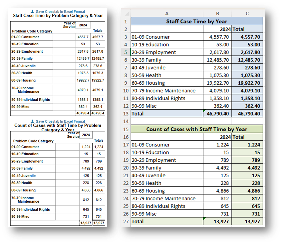
- If using LegalServer, click on Save Crosstab in Excel Format for both cross tabs and combine the downloaded data into one Excel file.
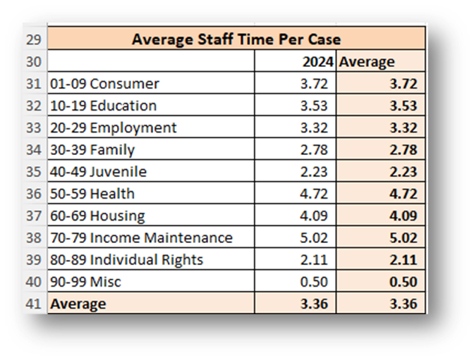
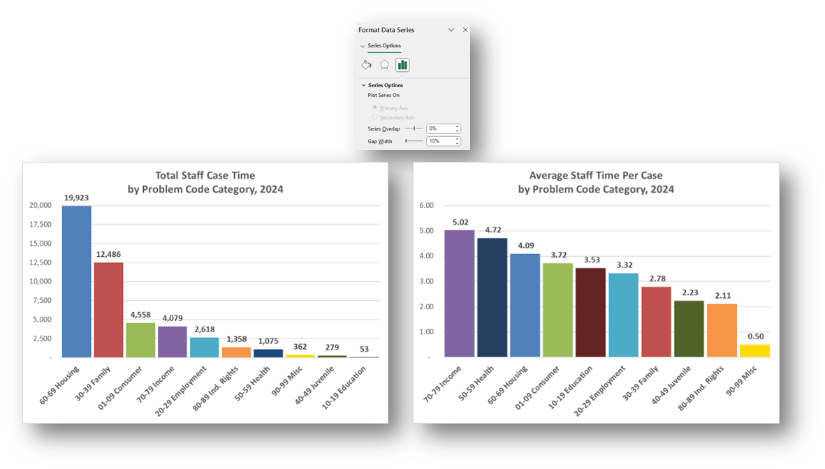
Calculate Average Staff Time Per Case by Problem Code Category by dividing the Staff Case Time by the Count of Cases with Staff Time for each Problem Code Category.
- Create Charts.
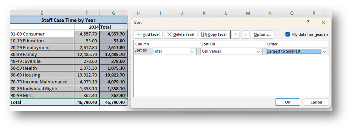
- Copy the three tables into columns to the right (columns E-G in this example) making sure to paste Values Only.
- Sort each separate table Largest to Smallest by their far-right Total or Average columns. Do include the Total column when sorting, but NOT the Total row in the sorting.
- Highlight the data in each table, excluding the Total column and Total row and select Insert from the ribbon across the top. A Clustered Column Chart is recommended.
- Format the charts as you prefer, making sure that the two charts are formatted similarly. Here are the formatting steps taken to create the following charts:
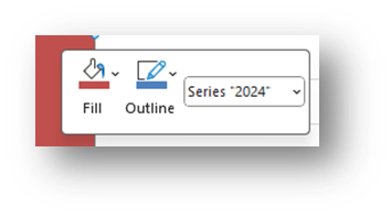
Change Column Colors to Match Across Charts: It may be easiest to allow Excel to automatically assign colors in the first chart. Then change the column colors of any subsequent charts so that each Problem Code Category shows the same color in every chart. Change the fill color for each column by right clicking within the column and selecting your preferred colors from the Fill option.
- Edit the Titles: Click on the existing titles and type over them. You may change the font size and make it bold. Make the same formatting changes in both charts.
- Shorten Problem Category Names: It may make chart spacing more uniform if you shorten the Problem Category Names in the tables to which the charts are linked.
- Delete the Legend.
- Add & Format Data Labels: Click on the top right corner of a chart, then click on the green plus sign to add Chart Elements. Check Data Labels. Right click on any data label and select Format Data Labels. From the Format Data Labels Pane, you can change what values appear as labels and change the Number format.
- Change the Column Overlap and & Gap Width Match Across Charts: Right click on any column in the first chart and select Format Data Series. Take note of the Series Overlap and Gap Width percentages. Right click on any column in any subsequent charts, select Format Data Series and make the Series Overlap and Gap Width percentages match the first chart.
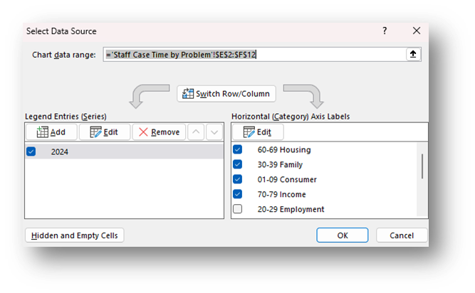
Create More Simplified Charts: Perhaps you are most interested in the top four Problem Code Categories. Copy both charts already created. In the copies, right click anywhere in the chart, click on Select Data, and uncheck all but the top four the Problem Code Categories.
Related Questions You May Ask
- How do hours worked compare by demographics and/or legal problems?
- Are we spending more time than we should on cases that we close with case status or close codes that indicate we were not able to serve the client? If so, should some of those cases be closed with service?