
Geographic Distribution
Description
Definition: Geographic distribution analysis examines how people, problems, or resources are distributed across a service area. Dividing the area into smaller subregions reveals spatial patterns.
Purpose: Identifies spatial dimensions of your organization’s reach and client needs.
Examples:
- Mapping cases by zip code.
- Showing distribution of foreclosure cases across counties.
Key Insight: Spatial patterns provide opportunities to learn about the geographic dimensions of your services and client needs, highlighting where interventions may be needed.
Example Data Question
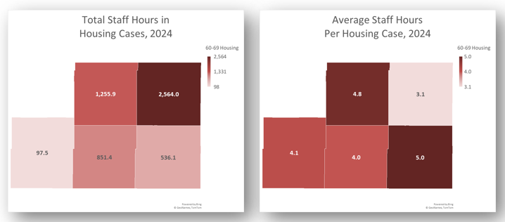
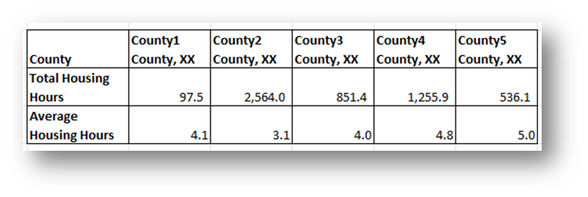
What was the distribution of total staff case hours and average staff hours per Housing case by county last year?
Recreate This Analysis
Data Sources
Timekeeping data from your case management system:
- Fields:
- Timekeeping fields: Date of Service, Hours, Activity Type, Activity Code, Advocate/User Type, Pro Bono Time
- Case Information: Matter/Case ID#, Legal Problem Code, Problem Code Categories, Close Reason, Rejection Reason, Disposition, etc.
- Demographics about which you are curious, such as Age at Intake, Gender, Race, Ethnicity, With Disabilities, Veteran, Percentage of Poverty, Number in Household, Citizenship Status, Language, Living Arrangement, County, State, Zip Code, etc.
- Filters/Report Structure:
- Date Filters: Date of Service in the last year.
- Exclude/Filter Out:
- Test or fake cases using whichever fields your organizations uses to identify these cases and clients, such as Rejection Reason, Client Name, Case Status, Funding Code, etc.
- Pro bono time by excluding any entries where Advocate/User Type=Pro Bono Advocate and making sure that Probono Time field is No or Null.
- Non-Case Time: Since this analysis is focused on case time, make sure the Matter/Case ID# is Not Empty.
- Attributes:
- Because Timekeeping reports can have a very large number or records and therefore take a long time to process and because the instructions below call for creating Crosstabs, once you’ve added all the fields you need, uncheck Show Tabular Format. Doing so will prevent the many thousands of records from appearing when the report is run, which should speed up processing time significantly. Note that the records will still in appear in the report’s Edit mode.
- Because Timekeeping reports can have a very large number or records and therefore take a long time to process and because the instructions below call for creating Crosstabs, once you’ve added all the fields you need, uncheck Show Tabular Format. Doing so will prevent the many thousands of records from appearing when the report is run, which should speed up processing time significantly. Note that the records will still in appear in the report’s Edit mode.
Example Analyses Steps
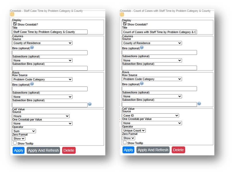
- Create 2 Crosstab that show (1) Hours by Problem Code Category by County and (2) Unique Count of Cases by Problem Code Category by County.
- Staff Case Time by Problem Category & County: Select the County of Residence field for Columns Source, select Problem Code Category for Row Source, and select Hours for Cell Value Source and Sum for Operator.
- Count of Cases with Staff Time by Problem Category & County: Select the County of Residence field for Columns Source, select Problem Code Category for Row Source, and select Case ID for Cell Value Source and Unique Count for Operator.
If you want to compare multiple data for multiple years, create a new “Year of Service” Field by adding the Date of Service field a second time, formatting it to show Year Only, and renaming it from “Date of Service” to “Year of Service”. Then Add Year of Service to the Column Subsection.
- Run the Report, Download the Crosstab Data, & Prepare it for Analysis.
- If using LegalServer, click on Save Crosstab in Excel Format for both cross tabs and combine the downloaded data into one Excel file.
- If the crosstab titles do not appear in the downloaded data, add them back in manually to avoid confusion about the contents of each crosstab.
- Remove any blank columns or rows or any awkwardly placed rows of columns in the downloaded data in preparation for analysis. Also remove unnecessary or awkwardly placed column or row headers in preparation for analysis.
- Add border lines, shading, change fonts, and change number formats to make the data easier to read.
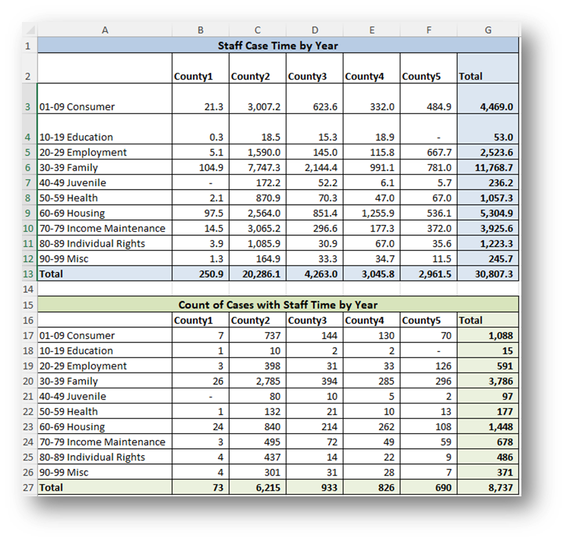
- If using LegalServer, click on Save Crosstab in Excel Format for both cross tabs and combine the downloaded data into one Excel file.
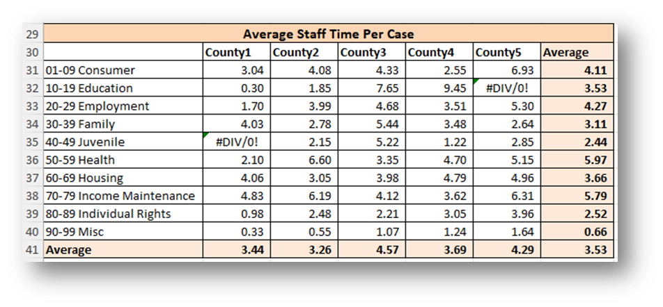
- Calculate Average Staff Time Per Case Per County by Problem Code Category by dividing the Staff Case Time by the Count of Cases with Staff Time for each Problem Code Category in each County.
- Create Reference Tables to the right of the data tables copying the data (Values Only) you want to map.
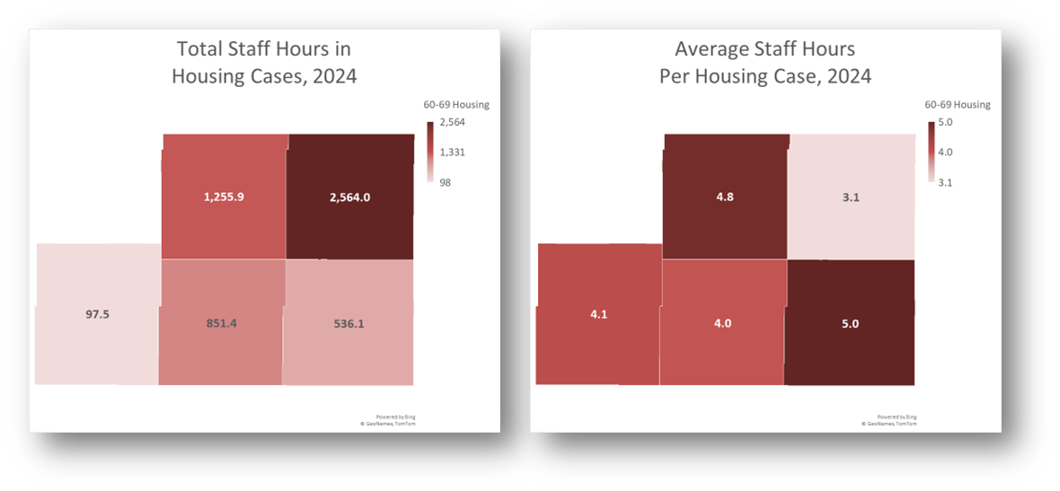
- In this example, 60-69 Housing total Case Time and Average Time Per Case.
- Add the word “County” after the county name, followed by a comma and the state name in each column.
- Add the word “County” to the top left cell in the table.
- Create Maps:
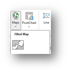
Highlight your reference table (in this example, highlight the County & Total Housing Hours for one map, and the County & Average Housing Hours for the second map), click on Insert across the top ribbon, and select Maps-Filled Maps.
- Change each Map title by simply clicking on “Chart Title” and typing your preferred title.
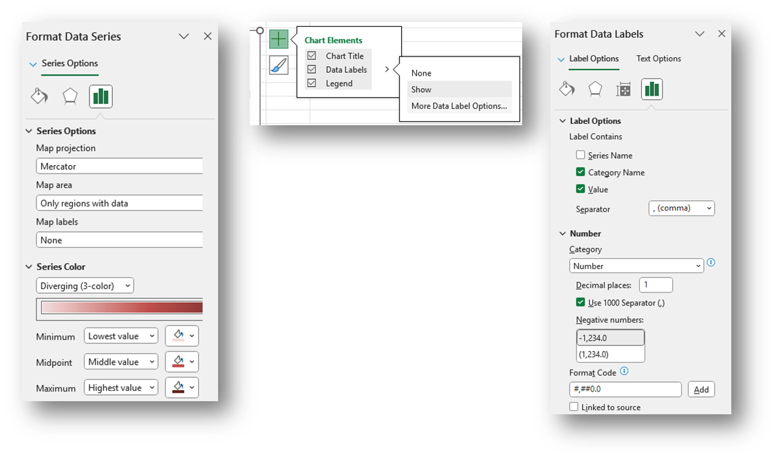
- Right-click on a shaded county in each map and select Format Data Series.
- Select Map projection (usually Automatic or Mercator) and consider changing Map area to Only regions with data. Leave Map labels set to None.
- You may leave the Series Color as Sequential (2-color) or change it to Diverging (3-color) and you may change any of the colors.
- To add labels, click the green plus sign in the top right corner of the map and selecting Data Labels in the Chart Elements box. To edit the Data Labels, select More Data Label Options to be taken to the Format Data Labels window.
- Check Category Name and Value and change the Number formatting if needed (county labels (Category Name) are not added to this visual to protect confidential information).
- Highlight any data label or the Legend on the map and change the font from the font options across the top of the Home screen.
- Refreshing Data: Once a spreadsheet like is set up, you may download new data and copy it into the tables from which the Maps pull data.
- Make sure the columns and rows of the new data match the columns and rows in the existing spreadsheet exactly.
- If you did not link your Maps to the data tables but instead created a separate reference table to the right of the data, make sure you copy new values into the reference table.
Related Questions You May Ask
- For cases or other services activities in which geographic areas are the most/least hours spent?
- For cases in which geographic areas are the most/least staff and pro bono hours worked?
- Are certain types of cases that require more time or less time coming from specific geographic areas?
- Do we tend to spend more time on cases for clients who live near our offices?