
Trend
Description
Definition: Trend analysis examines changes over time to identify patterns, spikes, or dips in client conditions or service needs.
Purpose: Tracks improving and/or worsening conditions, progress or regress, and emerging issues.
Examples:
- Monitoring increases in housing-related cases over five years.
- Tracking the seasonal variation of client intakes.
Key Insight: Analyze trends over a five-year period (or longer when possible). Unexpected changes, such as spikes or dips, may confirm expectations or raise new questions about whether proactive steps are necessary.
Example Data Question
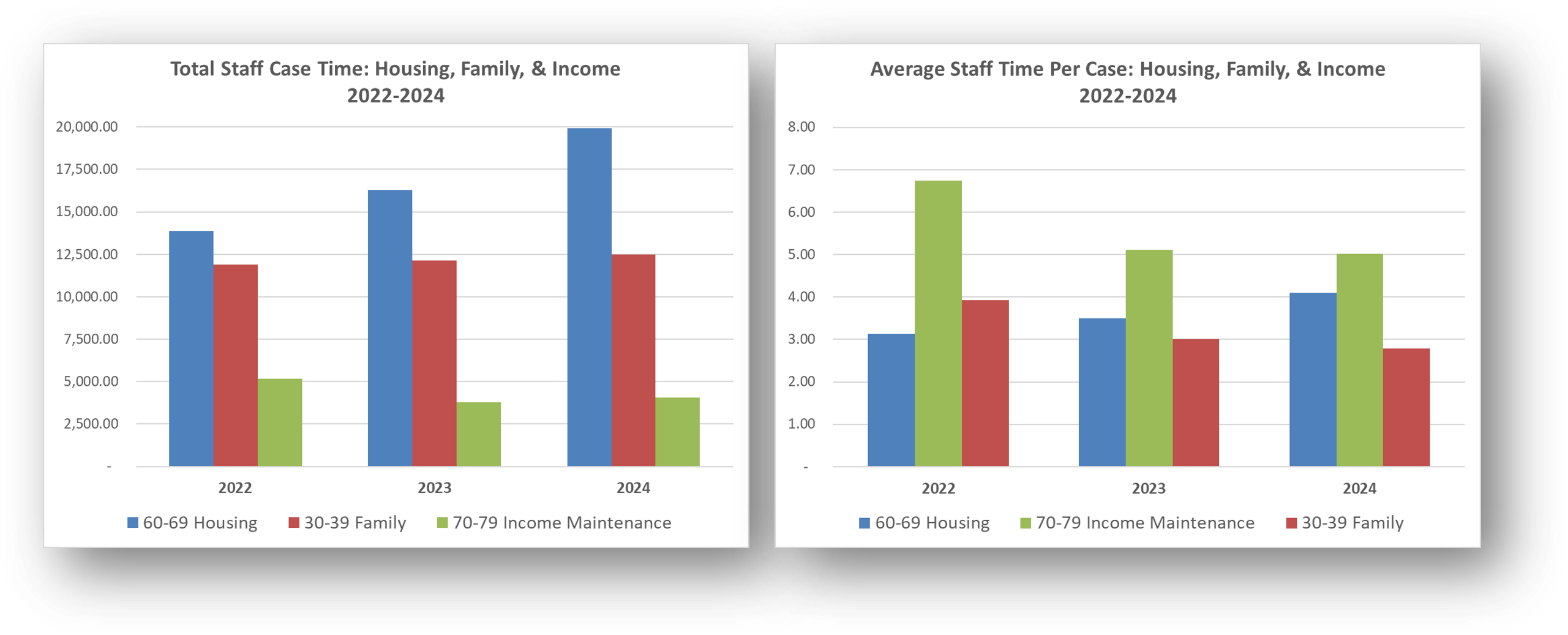
How have total staff case hours and average staff hours per case by Problem Code Category changed over the last 3 years?
Recreate This Analysis
Data Sources
Timekeeping data from your case management system:
- Fields:
- Timekeeping fields: Date of Service, Hours, Activity Type, Activity Code, Advocate/User Type, Pro Bono Time
- Case Information: Matter/Case ID#, Legal Problem Code, Problem Code Categories, Close Reason, Rejection Reason, Disposition, etc.
- Demographics about which you are curious, such as Age at Intake, Gender, Race, Ethnicity, With Disabilities, Veteran, Percentage of Poverty, Number in Household, Citizenship Status, Language, Living Arrangement, County, etc.
- Filters/Report Structure:
- Date Filters: Date of Service in the last 3 years.
- Exclude/Filter Out:
- Test or fake cases using whichever fields your organizations uses to identify these cases and clients, such as Rejection Reason, Client Name, Case Status, Funding Code, etc.
- Pro bono time by excluding any entries where Advocate/User Type=Pro Bono Advocate and making sure that Probono Time field is No or Null.
- Non-Case Time: Since this analysis is focused on case time, make sure the Matter/Case ID# is Not Empty.
- Attributes:
- Because Timekeeping reports can have a very large number or records and therefore take a long time to process and because the instructions below call for creating Crosstabs, once you’ve added all the fields you need, uncheck Show Tabular Format. Doing so will prevent the many thousands of records from appearing when the report is run, which should speed up processing time significantly. Note that the records will still in appear in the report’s Edit mode.
Example Analyses Steps
- In your case management system report, create a new “Year of Service” Field by adding the Date of Service field a second time, formatting it to show Year Only, and renaming it from “Date of Service” to “Year of Service”.
- Create 2 Crosstabs that show (1) Hours by Problem Code Category by Year and (2) Unique Count of Cases by Problem Code Category by Year.
- Staff Case Time by Year: Select the new Year of Service field for Columns Source, select Problem Code Category for Row Source, and select Hours for Cell Value and Sum for Operator.
- Count of Cases with Staff Time by Year: Select the new Year of Service field for Columns Source, select Problem Code Category for Row Source, and select Case ID for Cell Value and Unique Count for Operator.
- Run the Report, Download the Crosstab Data, & Prepare it for Analysis.
- If using LegalServer, click on Save Crosstab in Excel Format for both cross tabs and combine the downloaded data into one Excel file.
- If the crosstab titles do not appear in the downloaded data, add them back in manually to avoid confusion about the contents of each crosstab.
- Remove any blank columns or rows or any awkwardly placed rows of columns in the downloaded data in preparation for analysis. Also remove unnecessary or awkwardly placed column or row headers in preparation for analysis.
- Add border lines, shading, change fonts, and change number formats to make the data easier to read.
- If using LegalServer, click on Save Crosstab in Excel Format for both cross tabs and combine the downloaded data into one Excel file.
Calculate Average Staff Time Per Case Per Year by Problem Code Category by dividing the Staff Case Time by the Count of Cases with Staff Time for each Problem Code Category in each year.
- Create Charts.
- Copy the three tables into columns to the right (columns G-K in this example) making sure to paste Values Only.
- Sort each separate table Largest to Smallest by their far-right Total or Average columns. Do include the Total column when sorting, but NOT the Total row in the sorting.
- Highlight the data in each table, excluding the Total column and Total row and select Insert from the ribbon across the top.
- A Clustered Column Chart is recommended. But if when you select that chart option, the chart is not showing the Years along the X-axis, right click anywhere in the chart, click on Select Data, and then click on Switch Row/Column. Click on OK.
- A Clustered Column Chart is recommended. But if when you select that chart option, the chart is not showing the Years along the X-axis, right click anywhere in the chart, click on Select Data, and then click on Switch Row/Column. Click on OK.
- Format the charts as you prefer, making sure that the two charts are formatted similarly. Here are the steps taken to format these charts to these final versions:
- Change Column Colors to Match Across Charts: It may be easiest to allow Excel to automatically assign colors in the first chart. Then change the column colors of any subsequent charts so that each Problem Code Category shows the same color in every chart. Change the fill color for each column by right clicking within the column and selecting your preferred colors from the Fill option
- Change Column Order to Match Across Charts: Keep the first chart in descending order, but then, for ease of comparison across charts, force the order in subsequent charts to match the order in the first chart. Right click anywhere in the chart, click on Select Data, and then change the order of the Problem Code Categories to by using the up and down blue carrots in the Legend Entries (Series) section. Click on OK
- Edit the Titles: Click on the existing titles and type over them. You may change the font size and make it bold. Make the same formatting changes in both charts.
- Change the Column Overlap and & Gap Width Match Across Charts: Right click on any column in the first chart and select Format Data Series. Take note of the Series Overlap and Gap Width percentages. Right click on any column in any subsequent charts, select Format Data Series and make the Series Overlap and Gap Width percentages match the first chart.
- Create More Simplified Charts: Perhaps you are most interested in the top three Problem Code Categories. Copy both charts already created. In the copies, right click anywhere in the chart, click on Select Data, and uncheck all but the top three the Problem Code Categories.


Related Questions You May Ask
- How have total organizational hours, hours by practice group or office, hours by legal problem, and staff versus pro bono hours changed over time?