
Comparison
Description
Definition: Comparison analysis examines relationships between two or more variables to uncover insights about client conditions or data linkages.
Purpose: Highlights disparities, disproportionalities, differences, relationships, or conditions requiring further investigation.
Examples:
- Comparing service rates by gender or ethnicity.
- Analyzing links between poverty levels and case types.
Key Insight: When unexpected differences arise by demographics or legal problem, investigate to understand the data relationships and determine whether advocacy or services targeting multiple conditions are needed.
Example Data Question
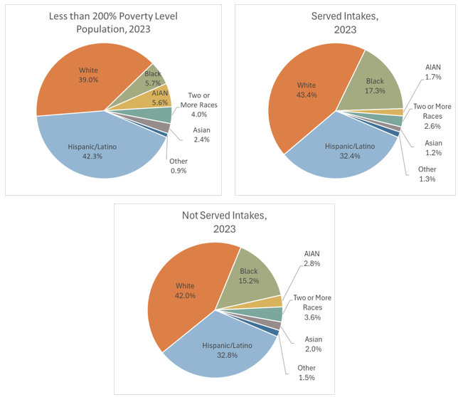
How does the racial/ethnic makeup of the people who request and receive assistance from my organization compare to the racial/ethnic makeup of the eligible population (less than 200% Poverty Level) in my service area? Are there any racial/ethnic groups who are underrepresented in our served cases?
Data Sources
U.S. Census Bureau’s American Community Survey (ACS) Public Use Microdata Sample (PUMS) via the Microdata Access Tool
- Benefits: With this data source and the MDAT tool, users have access to more topic details and can create custom tables, including access to several characteristic fields at custom poverty levels (i.e., demographic details of the less than 200% Poverty Level population), which is not available via standard American Community Survey data.
- Limitations: Limited geographic levels available: States, Public Use Microdata Areas (PUMAs), and national regions and divisions.
- To learn more about Public Use Microdata Sample (PUMS): American Community Survey Microdata.
- To learn more about the Microdata Access Tool: How-to Materials for Using the Microdata Access.
Intake data from your case management system:
- Fields:
- Demographics about which you are curious, such as Age at Intake, Gender, Race, Ethnicity, With Disabilities, Veteran, Percentage of Poverty, Number in Household, Citizenship Status, Language, Living Arrangement, County, etc.
- Dates: Date of Earliest, Intake Date, Prescreen Date, Open Date, Close Date, Date of Rejection, and Date of Birth (for use in an age-related formula).
- Case Information: Legal Problem Code, Problem Code Categories, Close Reason, Rejection Reason, Disposition, Intake Type, etc.
- Filters/Report Structure:
- Date Filters: Date of Earliest in last year, or Intake Date or Prescreen Date in last year.
- Exclude/Filter Out: Test or fake cases and clients and duplicate cases using whichever fields your organizations uses to identify these cases and clients, such as Rejection Reason, Client Name, Case Status, Funding Code, etc.
- Include: Cases that were closed with service (either in the year they were opened or later) and cases rejected without service.
- One Row/Record Per Case: Ensure that downloaded data includes just one record (one row) per case. If necessary, text join fields that cause more than one row/record per case.
- Export Format:
- If downloading from LegalServer, it is recommended that report results are exported as CSV files (an option that may be set up under Additional Display Format – remember to check Headers in First Row) and saved as Excel files to avoid formatting issues, particularly related to date fields.
Example Analyses Steps
Part 1: Collecting External Data Via the Microdata Access Tool (MDAT):
- Open the Microdata - Census Bureau Datasets (MDAT).
- Select a Dataset & Select a Vintage & click Next. (ACS 1-Year Estimates Public Use Microdata Sample for 2023).
- For information about choosing 5-year or 1-year estimates, refer to Using 1-Year or 5-Year American Community Survey Data.
- For information about choosing 5-year or 1-year estimates, refer to Using 1-Year or 5-Year American Community Survey Data.
- On the Variables screen, click on Select Geographies and either pick a State or multiple PUMA regions depending on the boundaries of your service area (in this example, a state is selected, but for confidentiality reasons, the state will be referred to as State in the following steps).
- X out of the screen when you have made your selection(s).
- X out of the screen when you have made your selection(s).
- To add variables for analysis, enter search term(s) in the Label box or review the Data Dictionaries for PUMS Files from the PUMS Documentation webpage.
- Race: Select the RAC1P field (or if you need more detailed race data, you may select from among the other race-related fields that appear when you enter “race” in the Label box).
- Hispanic: There is no ethnicity field so if you are interested in Hispanic ethnicity, you need to enter “Hispanic” in the Label box. Select the HISP field.
- Poverty: Select POVPIP, Income-to-poverty ratio. A message will appear explaining that this field is continuous and that you will have to create groups (i.e., <100% Poverty, <125% Poverty, etc.). Click on X to close that message. See instructions regarding creating groups below.
If any of your variables need to be grouped (like POVPIP), click on the Cart link near the top of the screen. If none of your variables need to be grouped, click on View Table in the bottom right of the screen when you have selected all variables.
- On the Cart screen, you can create groups and relabel categories. Note that the custom grouped fields you create will have “_RC1” at the end of the field names
- RAC1P field:
- Suggested Groups: White (White alone), Black (Black or African American alone), AIAN (American Indian alone, Alaska Native alone, & American Indian and Alaska Native tribes specified; or American Indian or Alaska Native, not specified and no other races), Asian (Asian alone), Other (Native Hawaiian and Other Pacific Islander alone (because this is a very small group in this area) and Some other race alone), and Two or More Races (Two or More Races).
- Click on Create Custom Group, enter a new label in the Group Label line (type over “Not Elsewhere Grouped”) and select all the race categories that should be included in the new group. Click on Save Group.
- Click on the pencil icon next to Not Elsewhere Grouped and repeat the last step until all custom Race groups are created.
- Rename the Field by clicking on its current title (Recode for Recoded detailed race code (RAC1P_RC1). Enter Race as the new label. Click Save.
- HISP field:
- Suggested Groups: Not Hispanic/Latino (Not Spanish/Hispanic/Latino) & Hispanic/Latino (all other options).
- Click on Create Custom Group, enter a new label in the Group Label line (type over “Not Elsewhere Grouped”) and select all the categories that should be included in the new group. Click on Save Group.
- Click on the pencil icon next to Not Elsewhere Grouped and repeat the last step until all custom Race groups are created.
- Rename the Field by clicking on its current title (Recode for Recoded detailed Hispanic origin (HISP_RC1). Enter Ethnicity as the new label. Click Save.
- POVPIP field:
- Suggested Groups: Different poverty levels could be defined, but for this example, because this organization can serve clients up to the Less than 200% Poverty Level, two groups are created: Less than 200% Poverty and 200% Poverty & Above.
- Click on Create Custom Group:
- Enter Less than 200% Poverty in the Group Label line (type over “Not Elsewhere Grouped”)
- Uncheck the category that begins with N/A and the 501 percent or more category.
- Click on the pencil icon next to the Below 501 percent category.
- Enter Minimum=0 and Maximum=199 in the pop-up window. Click Save. Click Save Group.
- Click on the pencil icon next to Not Elsewhere Grouped:
- Enter 200% Poverty & Above in the Group Label line (type over “Not Elsewhere Grouped”)
- Uncheck the category that begins with N/A.
- Leave Between 200 and 500 and 501 percent or more checked. Click Save. Click Save Group.
- Remove Not Elsewhere Grouped: Uncheck Not Elsewhere Grouped because all that remains in this group is the N/A category for whom poverty could not be measured.
- Rename the Field by clicking on its current title (Recode for Recoded detailed Income-to poverty ratio recode (POVPIP_RC1). Enter Poverty as the new label. Click Save.
- RAC1P field:
- Click on View Table at the bottom right side of the screen to be taken to the Table screen in which you can rearrange fields by rows and columns.
- Drag POVPIP_RC1 to Columns. Drag HISP_RC1 & RAC1P_RC1 to Rows next to Selected Geographies.
- Drag the non-grouped fields (RAC1P & HISP) into the section called Not on Table.
- Leave POVPIP in the Cell Value Options section.
- Under Select Cell Value Option, select Count.
- Under Select Weight, select PUMS person weight.
- Click on Download/Share in the bottom right side of the screen and select Excel and Export Table Data.
- Open the Excel file. Review the columns and rows and make formatting and text changes that will help you read the data, like boldening totals, changing the number format to show thousand separators, deleting subtotals if not needed, adding borders. See unformatted/unedited data on the left and formatted/edited data on the right:
- Copy the Non-Hispanic race numbers and the total Hispanic/Latino number from the Less than 200% column into a calculation table to the right of the data, sort the data from largest to smallest.


Part 2: Collecting Internal Case Management System Data:
- Download data from your case management system (CMS), use an API link to connect to data in your CMS, or connect to your CMS data directly via an ODBC connection or other method.
- Make sure to include intakes that were closed with service (either in the year they were opened or later) and cases rejected without service.
- Create Formulas in the downloaded data (using Excel in this example).
- The following formulas create categories that are helpful for analysis.
- Copy these formulas into cells in the far-right columns of your downloaded data (make sure to update the formula cell references so that they are pointing to the correct fields in your data).
- Add these formulas to all rows of data before creating pivot charts.
- Poverty Ranges: =IF(AND(AE2=0,ISBLANK(Z2)),"Unknown", IF(AND(AE2=0,NOT(ISBLANK(Z2))),"a. Below 100% FPL", IF(AE2<100,"a. Below 100% FPL", IF(AE2<125,"b. Below 125% FPL", IF(AE2<200,"c. Below 200% FPL", "d. 200%+ FPL")))))
- Note that AE2=Percentage of Poverty & Z2=Types of Income.
- Because some databases enter Poverty=0% when Income is blank, this formula ensures that you do not overcount those who actually have $0 income and 0% Poverty Level.
- Race Formula: =IF(AO2="Black or African American","Black", IF(AO2="American Indian or Alaska Native","AIAN", IF(OR(AO2="Other",AO2="Native Hawaiian or other Pacific Islander"),"Other", IF(OR(AO2="",AO2="Prefer not to disclose"),"Unknown", AO2))))
- Note that AO2=Race.
- This formula is written so that the race categories match the MDAT PUMS data downloaded earlier.
- Ethnicity Formula: =IF(OR(AP2="Hispanic",AQ2="Latino/Hispanic"),"Hispanic/Latino", IF(OR(AP2="Non-Hispanic",AQ2="Non-Latino/Non-Hispanic"),"Non-Hispanic/Non-Latino", IF(OR(AND(AP2="",AQ2=""),AQ2="Chose not to respond"),"Unknown", IF(AQ2<>"",AQ2,AP2))))
- Note that AP2=Ethnicity & AQ2=HUD 9902 Ethnicity.
- This formula takes entries in both ethnicity-related fields and defines ethnicity as Hispanic/Latino, Non-Hispanic/Non-Latino, or Unknown based on both fields.
- Served or Not: =IF(O2<>"","Not Served", IF(ISBLANK(N2),"Remaining Open", IF(OR(LEFT(N2,1)="A",LEFT(N2,1)="B",LEFT(N2,1)="F",LEFT(N2,1)="G",LEFT(N2,1)="H",LEFT(N2,1)="I",LEFT(N2,1)="K",LEFT(N2,1)="L"),"Served", IF(OR(LEFT(N2,1)="R",LEFT(N2,1)="X"),"Not Served",""))))
- Note that O2=Rejection Reason & N2=Close Reason.
- This formula divides cases up into Served, Not Served, & Remaining Open categories.
- The following formulas create categories that are helpful for analysis.
- Create Charts
- Click Insert along the top ribbon, then click on PivotTable.
- You will see a blank PivotTable.
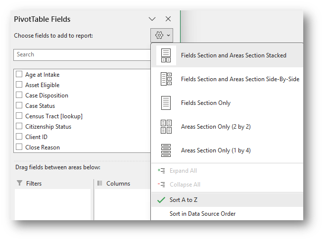
Sort the fields in the PivotTable Fields window, by clicking on the Gear Icon, and selecting Sort A to Z.
- Add the Matter/Case ID (or Case Number) field to the Values window and make sure the calculation is Count.
- If you see Sum of Matter/Case ID, click on the drop down, select Value Field Settings, and change the calculation type to Count.
- If you see Sum of Matter/Case ID, click on the drop down, select Value Field Settings, and change the calculation type to Count.
- Drag the newly created Ethnicity Formula and Race Formula fields into the Rows window and Served or Not Formula into the Columns window and notice how the PivotTable updates.
- Click on the Row Labels drop-down in the PivotTable and uncheck Unknown Ethnicity and Unknown Race.
- There may be significant blank data when working with intakes and prescreens. You may want to leave the blank data in your charts, but hiding it provides the viewers insight into the demographic characteristics among those for whom that characteristic is known. These known data can serve as a good representation, or proxy estimate, for all those who requested and received or did not receive assistance.
- In this example, we are interested in the intakes that were Served and Not Served, so hide the intakes that remain open, by unchecking Remaining Open in the PivotTable Column Labels drop-down.
- Note you may also filter the fields included in the PivotTable by clicking on the field names in the list of fields available for the PivotTable and clicking on the drop-down to the right of each field name. Fields that have filters applied will show a funnel icon in the field list.
- Copy the Non-Hispanic/Non-Latino race numbers and the total Hispanic/Latino numbers for both Served and Not Served intakes into calculation tables to the right of the data,
- Sort the data in the same order as the MDAT PUMS Eligible Population data calculation table.
- Create 3 charts using the MDAT data, the Served Intakes data, and Not Served Intakes data.
- Format the charts identically.
- Change the Chart Type: With any chart selected, click on Design along the top ribbon and then click on Change Chart Type (in this example, Pie Chart was selected).
- Change the color palette: With any chart selected, click on Design along the top ribbon and then click on Change Colors. Or change the fill color for each pie slice by right clicking within the slice and selecting your preferred colors from the Fill option
- Edit the Title: Click on the existing titles and type over them. You may change the font size and make it bold.
- Under Chart Elements, remove or move the Legend.
- Add Data Labels, and under Format Data Labels edit them to show Percentage and Category Name, change the Number Category, and adjust the number of decimals places that appear.
Findings: Compare the Served Intakes pie slices to the eligible population Less than 200% Poverty Level pie slices. Notice for example, the share of Served Intakes from Hispanic/Latino clients (32.4%) is smaller than their share of the eligible population (42.3%). This might indicate the need for more outreach among the Hispanic/Latino population in the service area. Other comparisons across pie charts may uncover other data relationships.


Related Questions You May Ask
- How do the number and demographics of people served compare to the demographics of the eligible population?
- How do the legal problems of people served and people rejected vary, especially for specific groups?