
Geographic Distribution
Description
Definition: Geographic distribution analysis examines how people, problems, or resources are distributed across a service area. Dividing the area into smaller subregions reveals spatial patterns.
Purpose: Identifies spatial dimensions of your organization’s reach and client needs.
Examples:
- Mapping cases by zip code.
- Showing distribution of foreclosure cases across counties.
Key Insight: Spatial patterns provide opportunities to learn about the geographic dimensions of your services and client needs, highlighting where interventions may be needed.
Example Data Question
Where do people live who requested and received assistance last year? 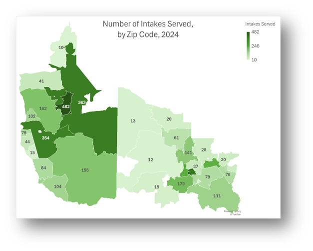
Recreate This Analysis
Data Sources
Intake data from your case management system:
- Fields:
- Demographics about which you are curious, such as Age at Intake, Gender, Race, Ethnicity, With Disabilities, Veteran, Percentage of Poverty, Number in Household, Citizenship Status, Language, Living Arrangement, County, State, Zip Code, etc.
- Dates: Date of Earliest, Intake Date, Prescreen Date, Open Date, Close Date, Date of Rejection, and Date of Birth (for use in an age-related formula).
- Case Information: Legal Problem Code, Problem Code Categories, Close Reason, Rejection Reason, Disposition, Intake Type, etc.
- Filters/Report Structure:
- Date Filters: Date of Earliest in last year, or Intake Date or Prescreen Date in last year.
- Exclude/Filter Out: Test or fake cases and clients and duplicate cases using whichever fields your organizations uses to identify these cases and clients, such as Rejection Reason, Client Name, Case Status, Funding Code, etc.
- Include: Cases that were closed with service, rejected without service, or remain open.
- One Row/Record Per Case: Ensure that downloaded data includes just one record (one row) per case. If necessary, text join fields that cause more than one row/record per case.
- Export Format:
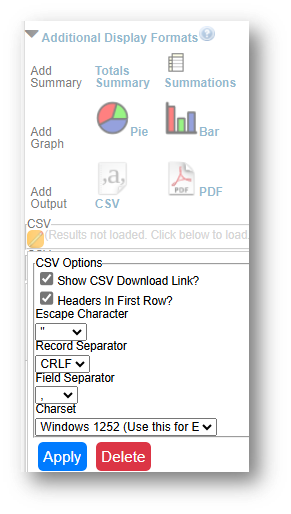
If downloading from LegalServer, it is recommended that report results are exported as CSV files (an option that may be set up under Additional Display Format – remember to check Headers in First Row) and saved as Excel files to avoid formatting issues, particularly related to date fields.
Example Analyses Steps
- Download data from your case management system (CMS), use an API link to connect to data in your CMS, or connect to your CMS data directly via an ODBC connection or other method.
- Create Formulas in the downloaded data (using Excel in this example).
- The following formulas create categories that are helpful for analysis.
- Copy these formulas into cells in the far-right columns of your downloaded data (make sure to update the formula references so that they are pointing to the correct fields in your data).
- Add these formulas to all rows of data before creating pivot charts.
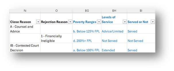
- Poverty Ranges: =IF(AND(AE2=0,ISBLANK(Z2)),"Unknown", IF(AND(AE2=0,NOT(ISBLANK(Z2))),"a. Below 100% FPL", IF(AE2<100,"a. Below 100% FPL", IF(AE2<125,"b. Below 125% FPL", IF(AE2<200,"c. Below 200% FPL", "d. 200%+ FPL")))))
- Note that AE2=Percentage of Poverty & Z2=Types of Income.
- Because some databases enter Poverty=0% when Income is blank, this formula ensures that you do not overcount those who actually have $0 income and 0% Poverty Level.
- Levels of Service =IF(O2<>"","Not Served", IF(ISBLANK(N2),"Remaining Open", IF(LEFT(N2,1)="A","Advice/Limited", IF(LEFT(N2,1)="B","Advice/Limited", IF(OR(LEFT(N2,1)="F",LEFT(N2,1)="G",LEFT(N2,1)="H",LEFT(N2,1)="I",LEFT(N2,1)="K",LEFT(N2,1)="L"),"Extended", IF(LEFT(N2,1)="X","Not Served"))))))
- Note that O2=Rejection Reason & N2=Close Reason.
- This formula divides cases up into Advice/Limited, Extended, Not Served, & Remaining Open categories.
- Served or Not: =IF(O2<>"","Not Served", IF(ISBLANK(N2),"Remaining Open", IF(OR(LEFT(N2,1)="A",LEFT(N2,1)="B",LEFT(N2,1)="F",LEFT(N2,1)="G",LEFT(N2,1)="H",LEFT(N2,1)="I",LEFT(N2,1)="K",LEFT(N2,1)="L"),"Served", IF(OR(LEFT(N2,1)="R",LEFT(N2,1)="X"),"Not Served",""))))
- Note that O2=Rejection Reason & N2=Close Reason.
- This formula divides cases up into Served, Not Served, & Remaining Open categories.
- The following formulas create categories that are helpful for analysis.
- Create Map.
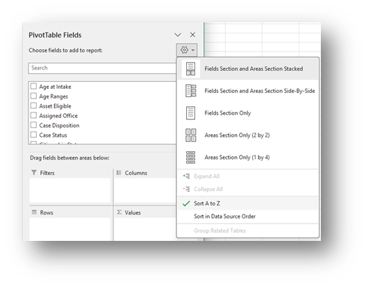
- Click Insert along the top ribbon, then click on PivotTable.
- Place the PivotTable in a New Worksheet and rename it Map.
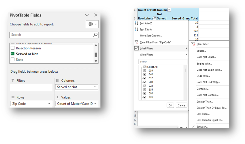
- Sort the fields in the PivotTable Fields window, by clicking on the Gear Icon, and selecting Sort A to Z.
- Add the Matter/Case ID (or Case Number) field to the Values window and make sure the calculation is Count.
- If you see Sum of Matter/Case ID, click on the drop down, select Value Field Settings, and change the calculation type to Count.
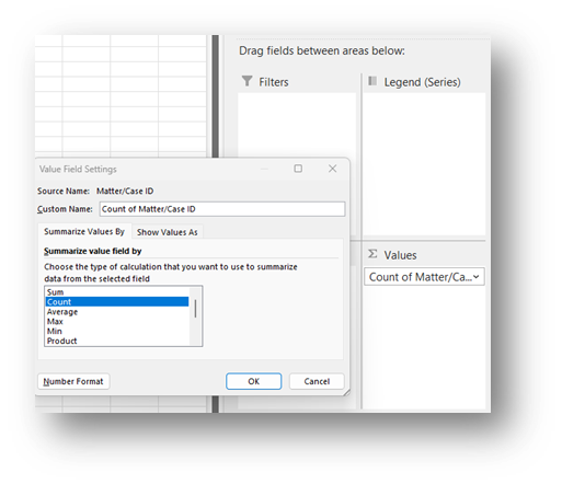
- If you see Sum of Matter/Case ID, click on the drop down, select Value Field Settings, and change the calculation type to Count.
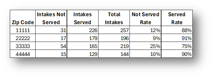
- Drag the Zip Code field in the Rows window. Click on the drop-down in the Row Labels cell of the PivotTable, click on Label Filters, select Between, and enter the range of Zip Codes in your service area in the Label Filter window that pops up (specific zip code numbers are distorted in this visual to protect confidential information).
- Drag the Served or Not formula into the Columns window.
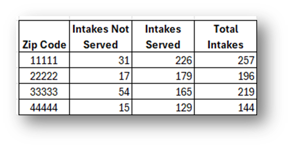
- Copy PivotTable data (values only) into a calculation table to the right of the data, change “Row Labels” to “Zip Code”.
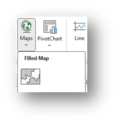
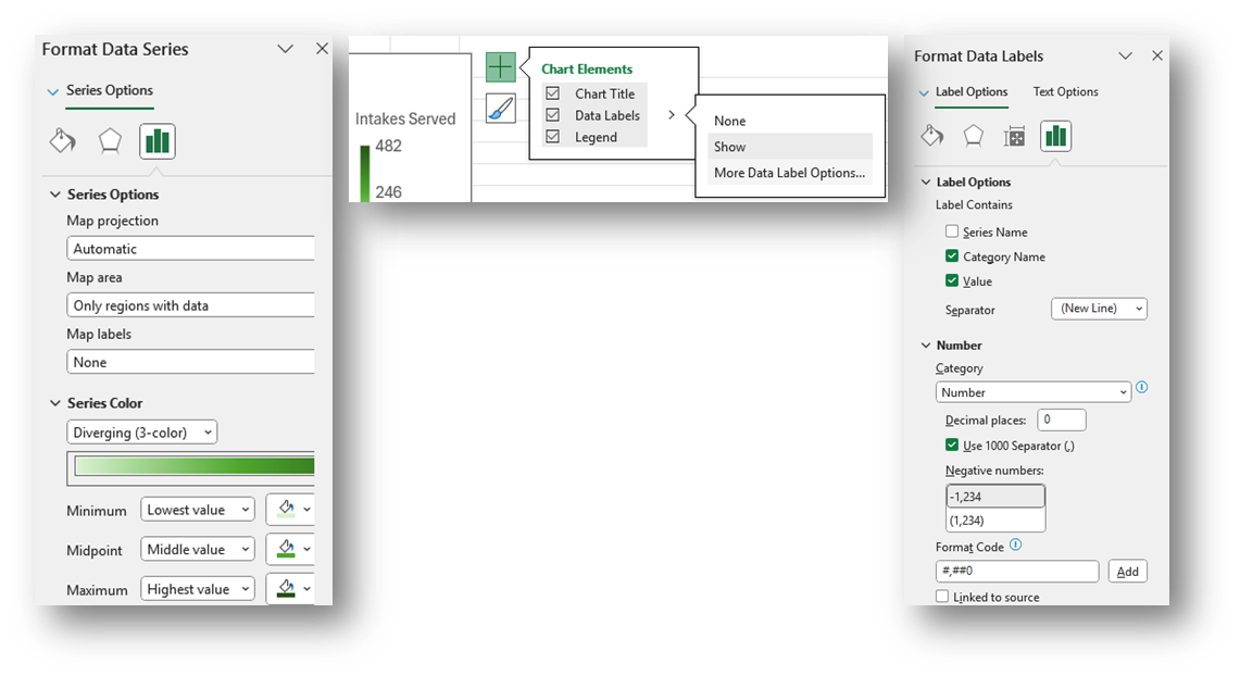
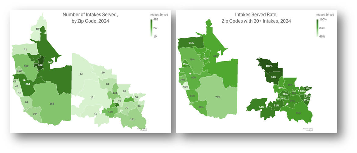
Highlight your calculation table (in this example, the Zip Code and Intakes Served columns), click on Insert across the top ribbon, and select Maps-Filled Maps.
- Change the Map’s title by simply clicking on “Chart Title” and typing your preferred title.
- Right-click on a shaded zip code in the map and select Format Data Series.
- Select Map projection (usually Automatic or Mercator) and consider changing Map area to Only regions with data. Leave Map labels set to None.
- You may leave the Series Color as Sequential (2-color) or change it to Diverging (3-color) and you may change any of the colors.
- To add labels, click the green plus sign in the top right corner of the map and selecting Data Labels in the Chart Elements box. To edit the Data Labels, select More Data Label Options to be taken to the Format Data Labels window.
- Check Category Name and Value and change the Number formatting if needed (zip code labels (Category Name) are not added to this visual to protect confidential information).
- Highlight any data label or the Legend on the map and change the font from the font options across the top of the Home screen.
- You may also want to create a map that calculates Served Rates for each Zip Code.
- Add percentage calculations (Intakes Served/Total Intakes) to your Calculation Table (see Not Served Rate & Served Rate in two far-right columns in table below).
- It is suggested that you limit the Zip Codes that appear to those with sufficient numbers of total intakes (minimum of 20 is ideal) to avoid misleading percentages in Zip Codes with small numbers of intakes.
- Click Insert along the top ribbon, then click on PivotTable.
- Refreshing Data: Once a spreadsheet like is set up, you may download new data and copy it into data tab from which the PivotTable and Map pulls data.
- Make sure the columns of the new data match the columns in the existing spreadsheet exactly.
- If there are more records in the new data, the formulas created in the far-right columns will need to be copied down to all rows.
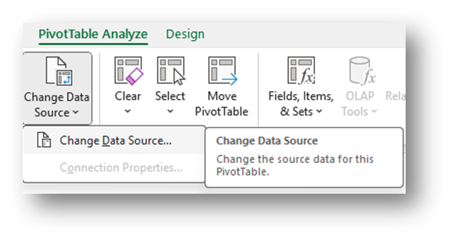
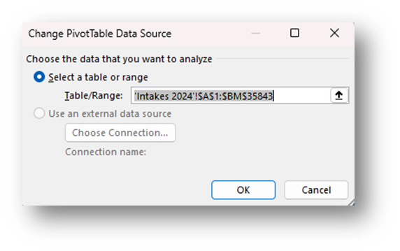
- From within your Map tab, select the PivotTable, then click on PivotChart Analyze along the top ribbon.
- Click on Change Data Source and make sure that all new rows of data are included. Click OK.
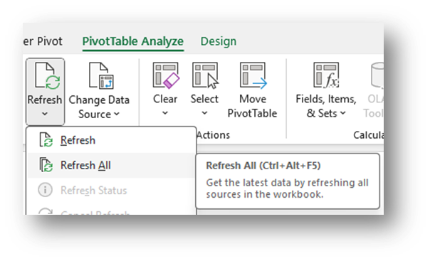
- Click on Refresh and Refresh All. Every PivotTable and Map in that tab should update. If not, repeat this step for each PivotTable.
Related Questions You May Ask
- Where do the people served and rejected live, including those from specific groups or with certain legal problems?
- What is the distribution of clients served throughout your service area?
- Are the rates of service high in certain areas and low in other areas? Are those levels what you would expect? Are there any surprises in specific areas?