

How to Use This Section:
Consider strategies for presenting data and processing analysis results.
What are different ways to present the analysis?
When choosing what to include in a presentation, consider questions, such as:
- What is important for the audience to know to answer the key question?
- What analysis findings challenge or bolster existing expectations?
- What trends or outliers are most relevant for the end audience?
- What information does the audience need to be able to fully contextualize results?
Make sure to consider the audience when presenting analysis findings. Presentations do not always need to be visual – it may be possible to succinctly convey a finding in writing, which could be an efficient way to communicate to the intended audience. Tables, which display information across rows and columns, are another popular format that can be used to communicate findings.
Aside from text and tabular formats, there are a range of visualizations that provide convenient, useful ways to convey important findings and examine potential relationships between multiple data points. Review a few of the most common types of visualizations below and take a deeper dive with Tableau’s Guide to Charts:

Good presentations adhere to the following principles:
- Keep it simple: Stick to consistent formatting, use colors and symbols strategically, and avoid adding unnecessary complexity. In other words, don’t include three charts when one sufficiently conveys the intended message. Tools such as I Want Hue and Color Brewer can help in selecting clear, aesthetic color palettes for visualizations.
- Include context: Add clear titles, labels, legends, and chart descriptions where appropriate so the audience can follow along easily. Include all the information the audience needs to fully understand the analysis somewhere within the presentation.
- Be accessible: Adhere to color contrast rules for color blind individuals, avoid relying on color as the sole indicator in a chart, include descriptions of visualizations for screen readers, and take other appropriate actions to make presentations accessible for all. To learn more, check out the Digital Accessibility Guide from the University of North Caroline’s School of Medicine IT, which includes guidance on color schemes for color blind individuals.
- Use appropriate chart types: Make sure to select appropriate visualizations for the data being displayed. The Data Visualization Catalogue and From-Data-to-Viz both contain primers on dozens of data visualization types and their functions. The University of California Berkley Library provides guidance on this process of selecting appropriate visualizations or charts.
Dashboards offer a way to display a collection of data summaries and visualizations. Dashboards are often interactive and exploratory - the user can typically apply filters and focus on different segments of the data according to their needs and interests. Dashboards are generally for ongoing use and get refreshed with up-to-date data at regular intervals.
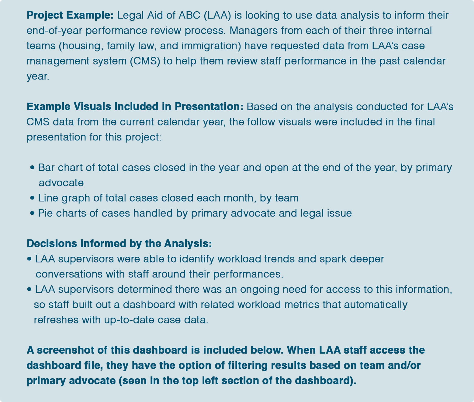
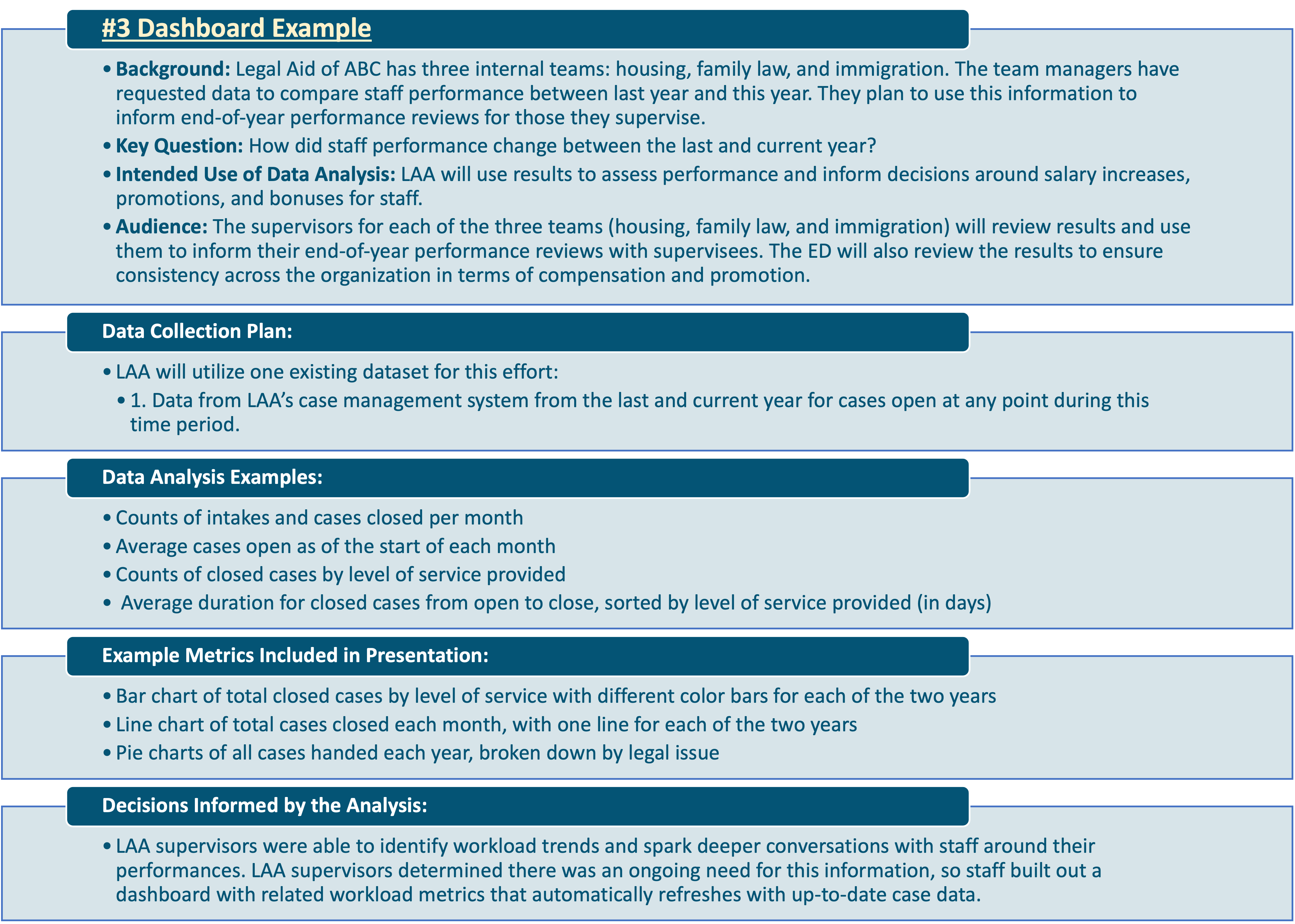
To learn more about dashboards visit the National Council of Nonprofit’s dashboard resource guide. Scroll to the end of this section for an example dashboard, based on the Performance Review project example referenced throughout the toolkit.
What are additional examples and resources for data visualization?
There are plenty of tools available to create data visualizations and dashboards, including Datawrapper, Excel, Google Data Studio, Infogram, Plotly, PowerBi, QGIS, and Tableau.
For more ideas and inspiration on data visualization, look to the following public resources from members of the legal aid community:
- U.S. Funding for Legal Aid: The American Bar Association created a dashboard using Tableau on the sources and amounts of funding for legal aid in the United States.
- COVID-19 Eviction Surveillance: The Eviction Solidarity Network in Travis County, Texas produced a dashboard using ArcGIS on eviction filings, hearings, and outcomes in their county.
- King County Eviction Tracker: The King County Bar Association in King County, Washington developed a dashboard using Power Bi on eviction filings and outcomes in their county.
- Client Services Dashboard: Community Legal Aid Services publicizes PDF files showcasing case and client data on a quarterly basis.
- Legal Information Website Usability Study Results: Michigan Legal Help conducted a usability analysis for their website; results and interpretations of findings are noted in this slide deck. See the bottom of this page to access the file with these results.
Check out the following webinars to learn more about data visualization strategies and tools:
- Data Visualization Tools: This LSNTAP webinar presents a series of cost-effective tools for data visualizations and reviews the theory behind good data visualization design.
- Visualizing Your Data Through Dashboards: This LSNTAP webinar offers a step-by-step walkthrough for creating a legal aid dashboard.
- Power Bi Community Integrations Call: This LegalServer presentation demonstrates an approach by the Legal Aid Foundation of Los Angeles to connect case management system data with third-party data analysis and visualization tool.
Crafting these presentations is essentially a work of storytelling. Focus the presentation on the most salient and relevant findings, instead of displaying all possible data. Keep the end audience in mind, including their level of data literacy, so they can glean insights from the analysis.
How should the audience approach data analysis results?
Data analysis involves selecting relevant data, conducting appropriate analyzes, and presenting pertinent results in a format accessible to the final audience. By adhering to this approach, the audience will have clear end results they can easily use to inform their intended next steps. A few tips to keep in mind:
- Expect the Unexpected: Analysis results may not be what was expected or desired – if there was absolute certainty about the trend or phenomena in question, there wouldn’t be a need for the analysis. Whether expected or desired, results present a learning opportunity all the same.
- Focus on Next Steps: Ideally, the use case for results will be articulated at the very start of the project. Reflect on this specification, adjust as needed, and determine the best course of action based on the results of the analysis. Keep in mind that a data analysis effort may not be one-time-only undertaking; results may lead to new questions or analysis needs.
- Create a Data Dictionary: Data dictionaries provide a concise summary of the meaning, purpose, and context behind the data points used in the project’s data set. This can be referenced by the audience, to make sure there is a consistent understanding of the underlying data. See the U.S. Department of the Interior’s Data Dictionary Guide for more information.
- Disseminate Results to Participants: Those who participate in the project, such as those responding to surveys or taking part in focus groups, have contributed their time, information, and/or resources for these efforts. Sharing results with them is a way to both acknowledge these efforts and encourage future participation.
What’s next?
This concludes the portion of the toolkit centered on the lifecycle and activities of a data analysis project. Continue onwards for the remaining sections:
- Building a Strong Data Culture: Recommendations to build a robust data culture at legal aid organizations, including strategies to maintain clean data and staff data work
- Overview of Evaluations: A review of evaluations, including a subset that makes use of data analysis and specific research techniques to inform and improve programs
- Data Analysis Snapshots: Examples of data analysis projects which walk through the various steps of the data analysis lifecycle
To explore the dashboard and data visualization example further, access the attached spreadsheet, Performance Review Project Example Data.This spreadsheet provides a deeper dive into the descriptive analysis, visualization examples, and dashboard for this example project.