
Geographic Concentration
Description
Definition: Geographic concentration analysis compares high or low concentrations of multiple variables to understand how location impacts client conditions. It often uses location quotients (LQs) to quantify concentrations.
Purpose: Highlights areas where services could be ramped up to better meet client need, and pinpoints "hotspots" or regions with specific emerging needs or resources.
Examples:
- Identifying neighborhoods with higher-than-expected concentrations of eviction cases.
- Comparing service levels with poverty concentrations across regions.
Key Insight: Concentration analysis reveals the interplay between variables and locations, helping you understand how geographic factors influence service needs or outcomes.
Example Data Question
How does the proportion of hours we worked in each county in our service area compare to each county’s share of the poverty population?
Recreate This Analysis
Data Sources
External Data from the U.S. Census American Community Survey data at Census Bureau Data:
- S1701 Poverty Status in the Past 12 Months
- Contents: Poverty (<100%) counts and percentages by age, sex, race, educational attainment, employment status, and work experience, and population totals by poverty at various levels (including <125%, <200%, etc.).
- Data Limitation: This table does not provide detailed demographic characteristics about the <125% poverty level population, but it does have data for all 5 counties, including counties with small populations.
Timekeeping data from your case management system:
- Fields:
- Timekeeping fields: Date of Service, Hours, Activity Type, Activity Code, Advocate/User Type, Pro Bono Time
- Case Information: Matter/Case ID#, Legal Problem Code, Problem Code Categories, Close Reason, Rejection Reason, Disposition, etc.
- Demographics about which you are curious, such as Age at Intake, Gender, Race, Ethnicity, With Disabilities, Veteran, Percentage of Poverty, Number in Household, Citizenship Status, Language, Living Arrangement, County, State, Zip Code, etc.
- Filters/Report Structure:
- Date Filters: Date of Service in the last year.
- Exclude/Filter Out:
- Test or fake cases using whichever fields your organizations uses to identify these cases and clients, such as Rejection Reason, Client Name, Case Status, Funding Code, etc.
- Pro bono time by excluding any entries where Advocate/User Type=Pro Bono Advocate and making sure that Probono Time field is No or Null.
- Non-Case Time: Since this analysis is focused on case time, make sure the Matter/Case ID# is Not Empty.
- Attributes:
- Because Timekeeping reports can have a very large number or records and therefore take a long time to process and because the instructions below call for creating Crosstabs, once you’ve added all the fields you need, uncheck Show Tabular Format. Doing so will prevent the many thousands of records from appearing when the report is run, which should speed up processing time significantly. Note that the records will still in appear in the report’s Edit mode.
- Because Timekeeping reports can have a very large number or records and therefore take a long time to process and because the instructions below call for creating Crosstabs, once you’ve added all the fields you need, uncheck Show Tabular Format. Doing so will prevent the many thousands of records from appearing when the report is run, which should speed up processing time significantly. Note that the records will still in appear in the report’s Edit mode.
Example Analyses Steps
Part 1: Collecting Internal Data:
- Create a Crosstab that shows Hours by County
- Select the County of Residence field for Columns Source and select Hours for Cell Value Source and Sum for Operator.
- Create a new “Year of Service” Field by adding the Date of Service field a second time, formatting it to show Year Only, and renaming it from “Date of Service” to “Year of Service”. Then Add Year of Service to the Row Source.
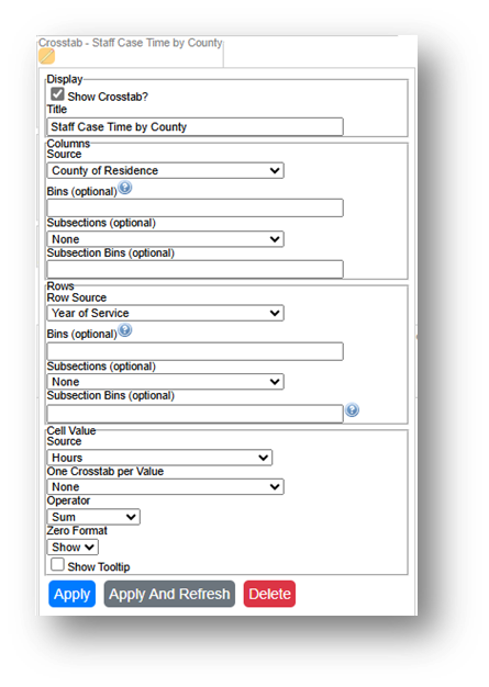
- Run the Report, Download the Crosstab Data, & Prepare it for Analysis.
- If using LegalServer, click on Save Crosstab in Excel Format.
- If the crosstab title does not appear in the downloaded data, add it back in manually to avoid confusion about the contents of the crosstab.
- Remove any blank columns or rows or any awkwardly placed rows of columns in the downloaded data in preparation for analysis. Also remove unnecessary or awkwardly placed column or row headers in preparation for analysis.
- Add border lines, shading, change fonts, and change number formats to make the data easier to read.
- Add the word “County” after the county name, followed by a comma and the state name in each column.
- Add the word “County” to the top left cell in the table.
- If using LegalServer, click on Save Crosstab in Excel Format.
- Add Share of Total Hours Row:
- Divide each county’s hours by the total hours to get each county’s share.
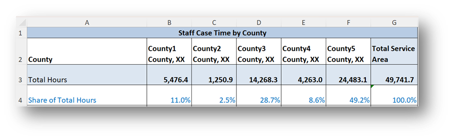
- Divide each county’s hours by the total hours to get each county’s share.
Part 2: Collecting External Data:
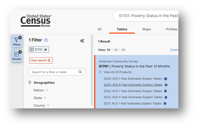
- Open the Census Bureau's Explore Census Data website.
Type "s1701" in the search bar for our example.
- In the future, if you know you need the S1701 Poverty Status in the Past 12 Months table, type "s1701" in the search bar. If you do not know the table name, you may enter a search term, such as "poverty" to be taken to a list of relevant tables, including S1701.

- Click on the S1701 table.
- Click on +View All 25 Products under the table name.
- Click on 2023: ACS 5-Year Estimates Subject Tables.
- If your geographies have populations over 65,000 you may stay with the default 1-Year Estimates, which provide more current, but less reliable data or you may use 5-Year Estimates, which provide less current, but more reliable 5-year averages. If some or all of your geographies have fewer than 65,000 people, you must select 5-Year Estimates.
- For information about choosing 5-year or 1-year estimates, click here: Using 1-Year or 5-Year American Community Survey Data.
- Under Geographies in the far-left filter panel, select a geographic level, and click on it (in this example: geographic level is County).
- Select a state.
Select all the counties in your service area.
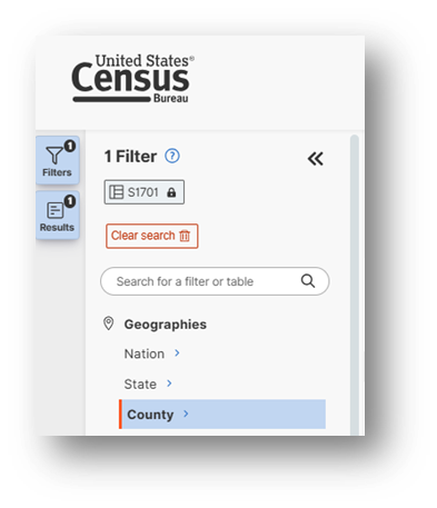
- Once all geographies have been added, click on close panel << button.
- Verify that 5-Year Estimates are still indicated under the table name in the top left and if instead 1-Year Estimates are indicated, click on the Dataset button and reselect 2023 5-Year Estimates.
- To avoid downloading the Margin of Error data, click on the Margin of Error button along the top ribbon before downloading the data.
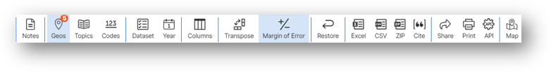
- Click on the Excel button along the table ribbon to download an Excel version of the table or the CSV button to download a CSV version of the table. If you do not see the Excel or CSV buttons in the top ribbon, click on More Tools at the far right of the ribbon.
- The Excel version is formatted to be more user-friendly and includes an Information tab that provides table details and notes whereas the CSV version includes only unformatted data.
- The CSV version can be easier to work with when you are downloading data for more than one geography as long as they are saved as Excel files after being downloaded in CSV format.
- Open the data file:
- If the numbers downloaded in text format, highlight the relevant cells, right click, and select Convert to Number.
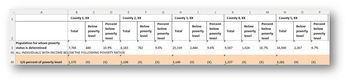
- Focus on the 125 percent of the poverty level row.
Part 3: Combine Data & Create Map:
- Add to the Table with Staff Hours by County:
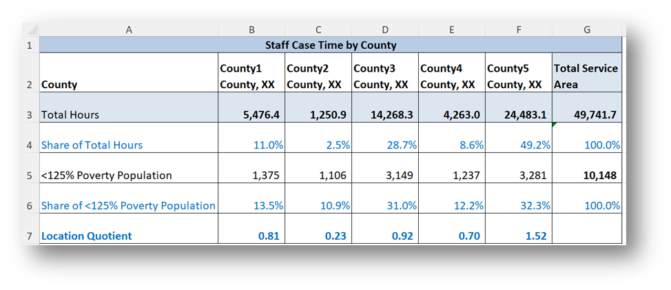
- Copy the less than 125 percent of poverty level numbers for each county into a new row in the table already created with staff hours.
- Calculate each county’s share of the <125% Poverty Population.
- Calculate each county’s Location Quotient by dividing the share of Total Hours by the share of <125% Poverty Population.
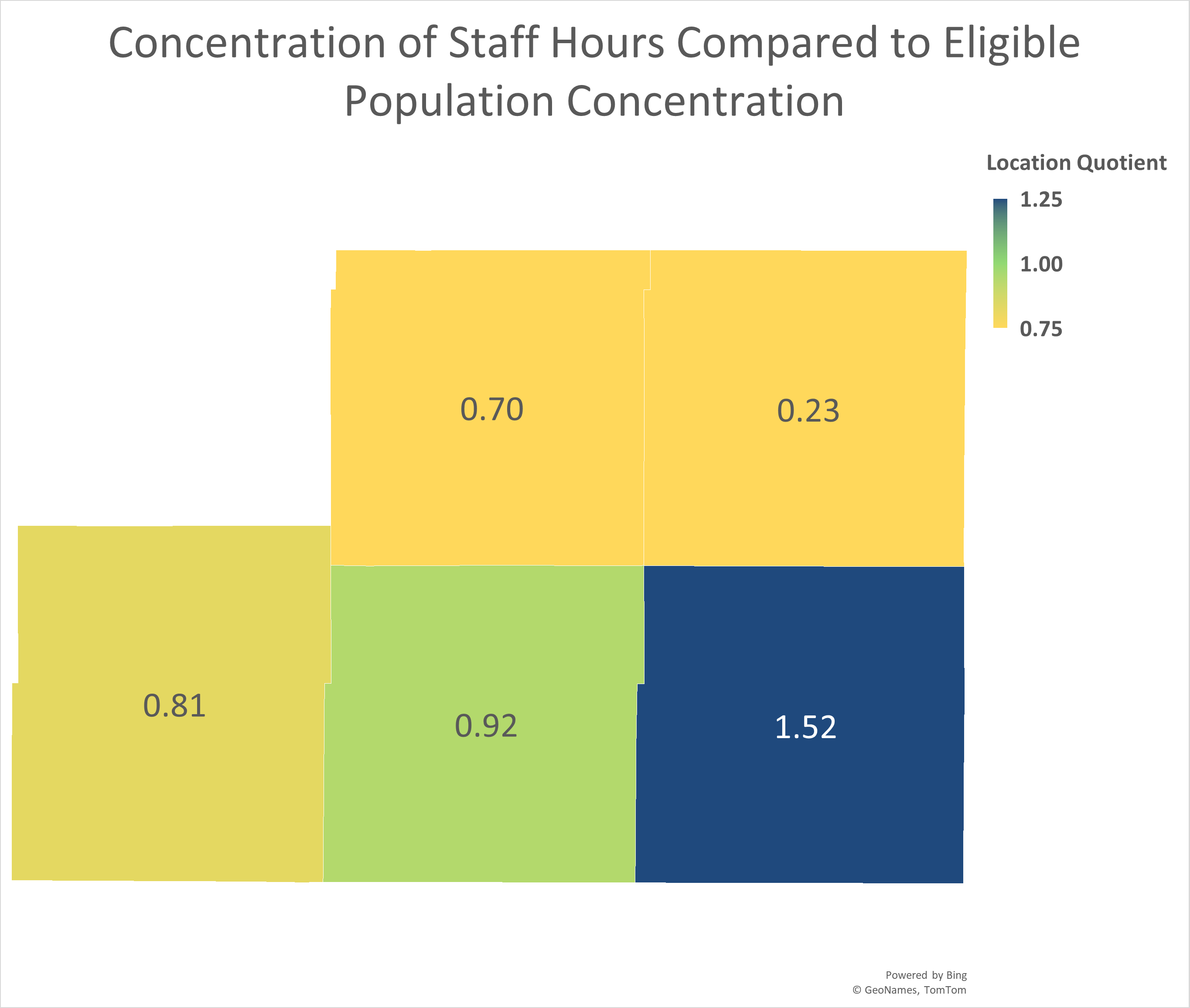
- Create map:
- Highlight the County row and the Location Quotient row in your calculation table and click on Insert-Maps-Filled Maps from the top ribbon.
- Change the Map’s title by simply clicking on “Chart Title” and typing your preferred title.
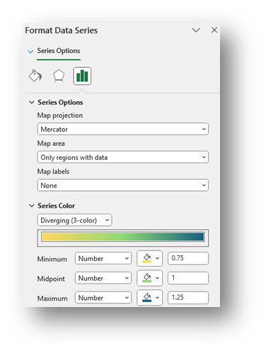
- Right-click on a shaded county in the map and select Format Data Series.
- Select Map projection (usually Automatic or Mercator) and consider changing Map area to Only regions with data. Leave Map labels set to None.
- Change the Series Color to Diverging (3-color) & Change the Minimum, Midpoint, and Maximum to Numbers and enter 0.75, 1, and 1.25. You may change any of the colors. Select colors that indicate less service than expected for numbers close to the Minimum, expected service for numbers close to the Midpoint, and more service than expected for numbers close to the Maximum.
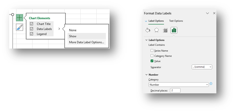
- To add labels, click the green plus sign in the top right corner of the map and selecting Data Labels in the Chart Elements box. To edit the Data Labels, select More Data Label Options to be taken to the Format Data Labels window.
- Check Category Name and Value and change the Number formatting if needed (county labels (Category Name) are not added to this visual to protect confidential information).
- Highlight any data label or the Legend on the map and change the font from the font options across the top of the Home screen.
Add a note explaining whether the LQs outside of or within the normal/expected range.

Related Questions You May Ask
- Does the geographic concentration of hours worked match the geographic concentration of eligible people, people requesting assistance, and/or people receiving service?
- Identifying concentration allows you to move beyond questions of “high/low” to questions of “more than expected or less than expected”.
- The location quotient is a commonly used measure of concentration, and it can yield important insights into the data.
- Are there communities in your service area generating fewer than expected work hours (LQ <1)? Why might that be?
- Are there communities in your service area generating more than expected work hours (LQ>1)? Do you know why?
- Are levels of concentration throughout your service area (the distribution of LQs on a map) the result of a conscious effort on the part of your organization, or is it simply determined by the population seeking your services?